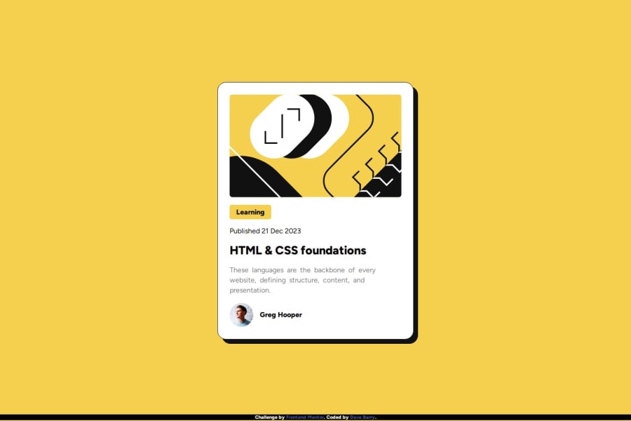


Design comparison

Solution retrospective
I feel like my use of Flexbox and media queries improved, and figured out how media queries cascade/override one another based on the screen size satisfying certain conditions. Overall happy with the result here, I could have spent more time tweaking the font spacing/size, element padding and margins, etc to get it more true to the original design but I mostly wanted to work to the spirit of the challenge rather than spend a bunch of time getting it 'perfect'.
What challenges did you encounter, and how did you overcome them?Not a challenge per se, but I was thinking I maybe could have used the vh and vw values to adjust the size of elements so it would be more dynamically responsive to screen size changes, rather than just hardcoding 3 different sizes. I was thinking maybe clamp() would be the way to go about this, so I could keep the values within a reasonable range, but also not have to hardcode values for multiple media queries.
What specific areas of your project would you like help with?See above, I'm open to suggestions on how to achieve a more dynamic solution for styling responsiveness.
Community feedback
Please log in to post a comment
Log in with GitHub
Join our Discord community
Join thousands of Frontend Mentor community members taking the challenges, sharing resources, helping each other, and chatting about all things front-end!
Join our Discord