Submitted 6 months ago
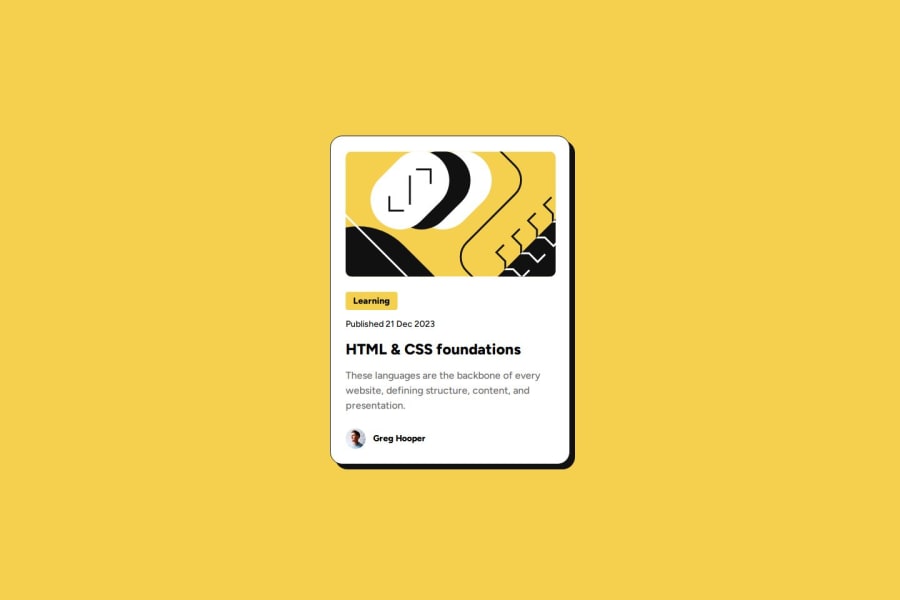
Blog Preview Card (HTML + CSS)
#bem
@SantiagoGelvez
Design comparison
SolutionDesign
Solution retrospective
What are you most proud of, and what would you do differently next time?
I finished this project as better as I can and I'm very happy with the result. I tried to improve the name of the classes and in the future give some backend and next pages.
What challenges did you encounter, and how did you overcome them?Is similar to QR code, so the challenges was similar. However, while develop this, it was easiest because I have fresh concepts.
What specific areas of your project would you like help with?All necesary to improve the way I code.
Community feedback
Please log in to post a comment
Log in with GitHubJoin our Discord community
Join thousands of Frontend Mentor community members taking the challenges, sharing resources, helping each other, and chatting about all things front-end!
Join our Discord
