

Design comparison
SolutionDesign

Community feedback
- @EstairePosted 3 months ago
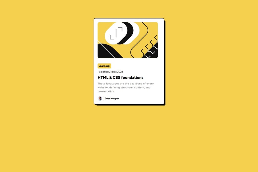
Decent attempt. Some padding, border radius and box shadow improvements could be made to make it more similar to the design.
0 - @tonyboy06Posted 3 months ago
I think you need to center vertically the card and try to minimize the border of the card. Also, add some border-radius a little bit. That's all. Thanks!
0


Please log in to post a comment
Log in with GitHubJoin our Discord community
Join thousands of Frontend Mentor community members taking the challenges, sharing resources, helping each other, and chatting about all things front-end!
Join our Discord