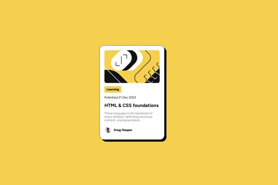
Design comparison
SolutionDesign
Solution retrospective
What are you most proud of, and what would you do differently next time?
Got to use nested CSS which was quite fun to learn. Want to incorporate this more in my own designs.
What challenges did you encounter, and how did you overcome them?Had to google styling of the tags as I couldn't recall from memory
What specific areas of your project would you like help with?Any feedback on code quality and any improvements I could make.
Community feedback
- @njohnson68Posted 10 months ago
Hi Jennifer!
Potential improvements I see are some typos in the gray text blob as well as the lines in that particular blob needing to be spaced a bit farther apart.
Otherwise, well done!
Marked as helpful0
Please log in to post a comment
Log in with GitHubJoin our Discord community
Join thousands of Frontend Mentor community members taking the challenges, sharing resources, helping each other, and chatting about all things front-end!
Join our Discord
