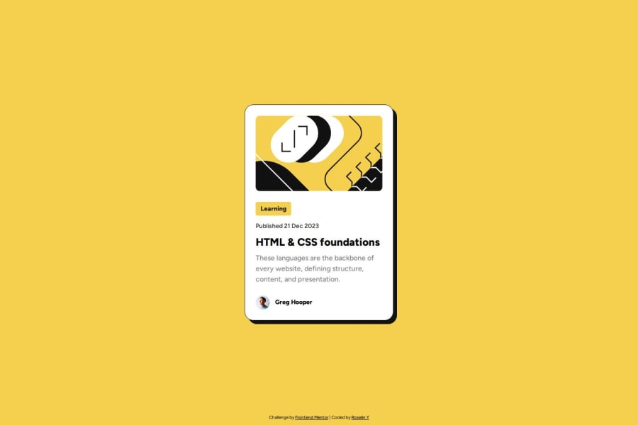
Design comparison
SolutionDesign
Solution retrospective
What are you most proud of, and what would you do differently next time?
i was able to make this page as accurate as possible using the Figma file. i was able to use em and rem as the measurement in most of the elements used. using flexbox for media query was really helpful to make it responsive
What challenges did you encounter, and how did you overcome them?none
What specific areas of your project would you like help with?feel free to review my code and live site, i'm open to any suggestion especially on how to make the code more accessible.
Community feedback
Please log in to post a comment
Log in with GitHubJoin our Discord community
Join thousands of Frontend Mentor community members taking the challenges, sharing resources, helping each other, and chatting about all things front-end!
Join our Discord
