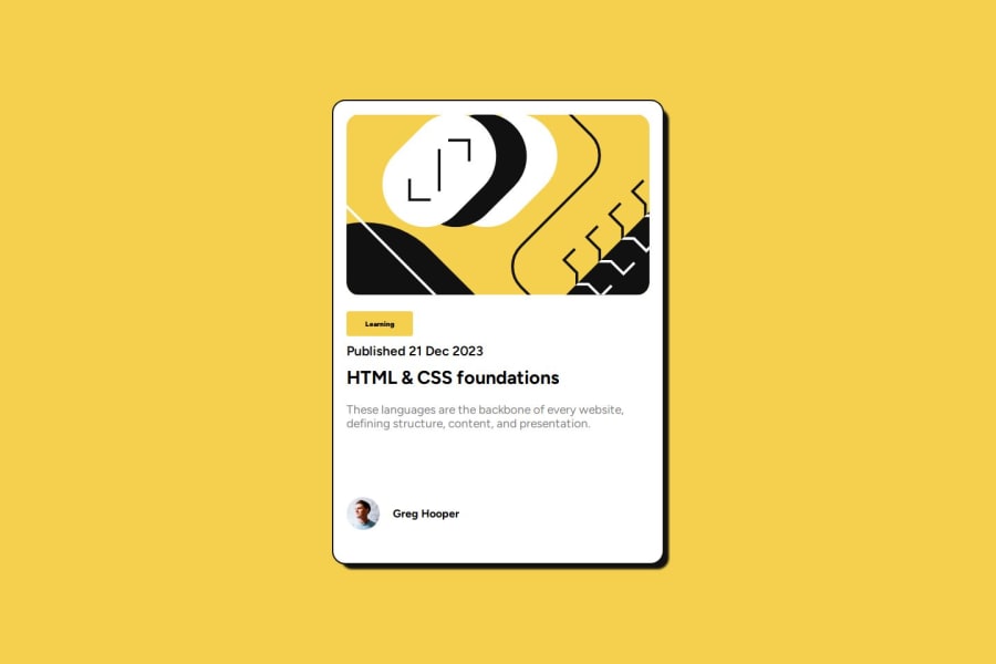
Design comparison
Solution retrospective
- playing around with box shadow
- have more sense for flex box
- manage the image to be able stretch as we expected, media query helps
- how to be able to slice the design to actual imput
Community feedback
- @alberto-rjPosted 8 months ago
Hi, @dorman99! Congratulations on investing your time and leveling up with the challenge, Blog preview card.
I'm Alberto and I have some code suggestions that can help you improve your solution to this challenge.
SPECIFY THE MAIN TITLE OF THE PAGE
It could help improve the usability, SEO for your page.
Bad
<p class="heading">HTML & CSS foundations</p>Good
<h1 class="heading">HTML & CSS foundations</h1>SPECIFY THE FOOTER OF THE PAGE
Instead of using the HTML code
<div class="attribution">...</div>, you could use<footer>...</footer>. Because in this case, the<footer>tag has more semantic meaning.Happy coding! 🚀
0@dorman99Posted 8 months agohi @alberto-rj !! be specific using semantic tag can help the seo, noted ! really appreciate it !
0
Please log in to post a comment
Log in with GitHubJoin our Discord community
Join thousands of Frontend Mentor community members taking the challenges, sharing resources, helping each other, and chatting about all things front-end!
Join our Discord
