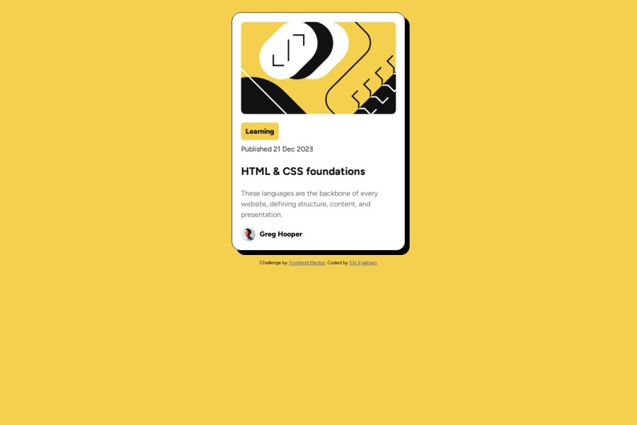
Design comparison
SolutionDesign
Solution retrospective
What are you most proud of, and what would you do differently next time?
I'm getting better at this stuff. I would wish to construct a better alignment in my pages next time.
What challenges did you encounter, and how did you overcome them?Aligning the main content- the full box was and still is a problem.
What specific areas of your project would you like help with?Alignment (centering to be specific) of div elements.
Community feedback
- @SvitlanaSuslenkovaPosted about 2 months ago
I see you added flex, but your project didn't align to the center. The problem is you should add to your flex also min-height: 100vh; Currently, the height of the body is the same as the component in it.
0
Please log in to post a comment
Log in with GitHubJoin our Discord community
Join thousands of Frontend Mentor community members taking the challenges, sharing resources, helping each other, and chatting about all things front-end!
Join our Discord
