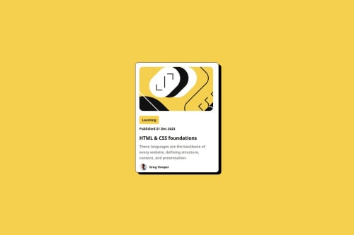
Design comparison
Solution retrospective
Im so happy to have complete these project and make it responsive what really makes me happy being part of these challenge and finding a solution to it i feel like i did something great. i can"t wait to try another challenges and learn something new
What challenges did you encounter, and how did you overcome them?i have always find it really hard to make my own exactly like the design i try spending some couples of hours on it and try make sure it looks exactly like the design and im so happy how it later turns out. making it responsive its really im so happy i faced it all
What specific areas of your project would you like help with?Any feedback will be ok its keep me learning and stay on tracks.
Community feedback
- @gmagnenatPosted about 2 months ago
Hi, congrats on giving this challenge a try!
Here is a list of things I noticed that could be improved to enhance your solution and possibly your other projects:
- It would be great to have a personalized README. There is a template in the project files. Remove what you don't need and add more info about the challenges you faced and the good things you learned. Having a good README in your project can be very beneficial for someone reviewing your GitHub profile. It creates a good impression.
- Remove the elements you don't need from your HTML.
- You can simplify your HTML by removing this inner section. I understand you used it for the black border animation, but you can achieve this with a pseudo-element on your card.
- The card image is meaningful and is related to the blog topic, so you should not use a background image here. Instead, use an
img
element with a properalt
attribute. - You should not skip headings. Use another HTML element if necessary, but keep them in order (h1, h2, h3, etc.). This helps with understanding the page structure and content organization. The date is not a heading. The author’s name is not a heading.
- This is a preview card leading to a blog post, so you need a link in the heading.
- You don't need to wrap everything in a section; it's not necessary here. You already have the
<main>
landmark, so you can go straight to your carddiv
. - You need to add a modern CSS reset at the top of your stylesheet in all your projects. This will help you focus on clean code and ensure better cross-browser support. Look up for Andy Bell's css reset or Josh Comeau.
- Use
min-height
on yourbody
, not just a simple height, as content can grow if the user increases the font size. - You should not use a fixed height for elements containing text. The amount of text can vary, and the font size might be increased by users who need larger text.
- You don't want to use a fixed width in pixels for the same reason. As the text size increases, the content needs to adjust accordingly. Use relative units such as
rem
and amax-width
value. - You should not apply styles directly to the HTML element. Add a class and style it through the class. For example, you set a width of 30px on the
img
element. If there are other images on the page, they will all be 30px wide. - Overall, you need much better structure in your HTML and CSS. Specifically, the CSS is hard to navigate and understand. Work from top to bottom, left to right. Organize your HTML with the correct semantic elements.
There are still other things I could comment on, but this is already quite a long list. Let me know if anything is unclear. Once you've refactored your solution, I can take another look and point out additional areas for improvement.
Cheers, and happy coding!
Marked as helpful2
Please log in to post a comment
Log in with GitHubJoin our Discord community
Join thousands of Frontend Mentor community members taking the challenges, sharing resources, helping each other, and chatting about all things front-end!
Join our Discord