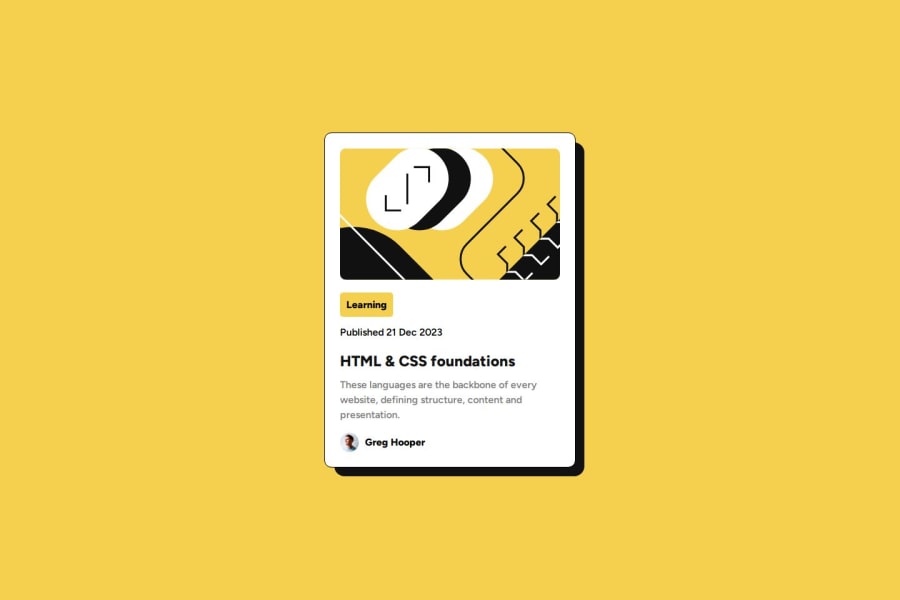
Design comparison
Community feedback
- @rayaattaPosted 10 months ago
Hello 👋Beyza Arslan, Great solution.
I have some suggestions you might find useful
1 In order to make your html more semantic replace
<div class="card">with<main class="card">. Using semantic markup improves SEO and improves user experience for people using assistive technology.2 Since the illustration image is decorative its alt attribute should be left empty. i.e
alt=""3 I noticed
font-family: "Figtree", "sans-serif";but sincesans-serifis not imported you should not wrap it in quotes. replace that line of code withfont-family: "Figtree", sans-serif;I hope this helps. Happy coding 🙃 and great solution.
Marked as helpful1
Please log in to post a comment
Log in with GitHubJoin our Discord community
Join thousands of Frontend Mentor community members taking the challenges, sharing resources, helping each other, and chatting about all things front-end!
Join our Discord
