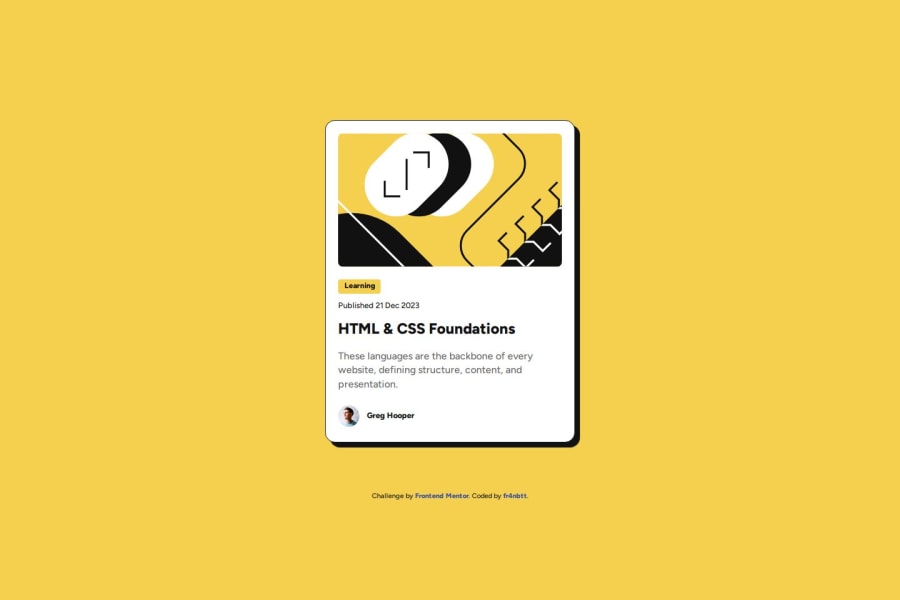


Design comparison

Community feedback
- @StroudyPosted about 2 months ago
Exceptional work! You’re showing great skill here. I’ve got a couple of minor suggestions that could make this stand out even more…
-
This does not matter that much at this stage but something to be mindful of for SEO(Search Engine Optimisation),
<meta>description tag missing that helps search engine determine what the page is about, Something like this<meta name="description" content="description goes here" /> -
For future project, You could download and host your own fonts using
@font-faceimproves website performance by reducing external requests, provides more control over font usage, ensures consistency across browsers, enhances offline availability, and avoids potential issues if third-party font services become unavailable. Place to get .woff2 fonts -
Using a full modern CSS reset is beneficial because it removes default browser styling, creating a consistent starting point for your design across all browsers. It helps avoid unexpected layout issues and makes your styles more predictable, ensuring a uniform appearance on different devices and platforms, check out this site for a Full modern reset
-
Two mini resets here you should probably only have one,
* { margin: 0; padding: 0; box-sizing: border-box; } * { margin: 0; padding: 0; box-sizing: border-box; }- While
pxis useful for precise, fixed sizing, such asborder-width,border-radius,inline-padding, and<img>sizes, it has limitations. Pixels don't scale well with user settings or adapt to different devices, which can negatively impact accessibility and responsiveness. For example, usingpxfor font sizes can make text harder to read on some screens, Check this article why font-size must NEVER be in pixels. In contrast, relative units likeremand adjust based on the user’s preferences and device settings, making your design more flexible and accessible. Usepxwhere exact sizing is needed, but prefer relative units for scalable layouts. If you want a deeper explanation watch this video by Kevin Powell CSS em and rem explained. Another great resource I found useful is this px to rem converter based on the default font-size of 16 pixel.
body {
  font-size: 16px; }
I hope you’re finding this guidance useful! Keep refining your skills and tackling new challenges with confidence. You’re making great progress—stay motivated and keep coding with enthusiasm! 💻
Marked as helpful1 -

Please log in to post a comment
Log in with GitHub
Join our Discord community
Join thousands of Frontend Mentor community members taking the challenges, sharing resources, helping each other, and chatting about all things front-end!
Join our Discord