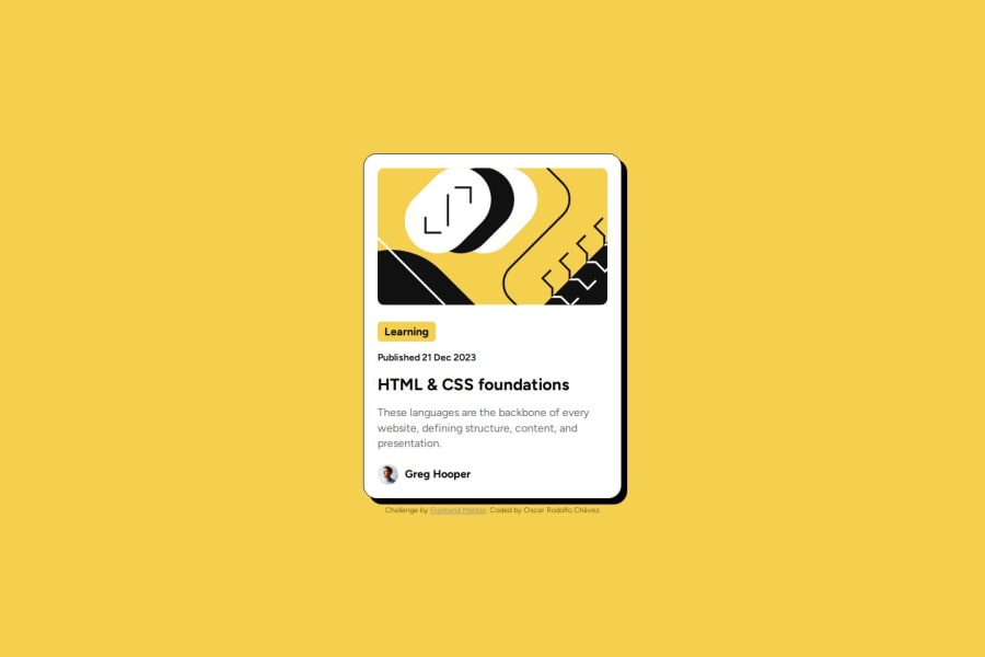
Design comparison
Community feedback
- @AhmedAtef32Posted 5 months ago
You did it the way you wanted. I like the way you used semantic tags. But I have a comment that I always put the img in the div.
Marked as helpful0 - @tuhamworldPosted 5 months ago
You did a great job by including semantic HTML, ensuring responsiveness across devices, and making the layout look good.
My comments would be on your code structure.
Since you have an external stylesheet, you can have the attribution styles moved from inline to an external stylesheet.
Additionally, I recommend creating a folder called CSS and having your styles.css in the folder. This will make your project look more organized
Well done for the efforts once again
Marked as helpful0
Please log in to post a comment
Log in with GitHubJoin our Discord community
Join thousands of Frontend Mentor community members taking the challenges, sharing resources, helping each other, and chatting about all things front-end!
Join our Discord
