Solution retrospective
What are you most proud of, and what would you do differently next time?
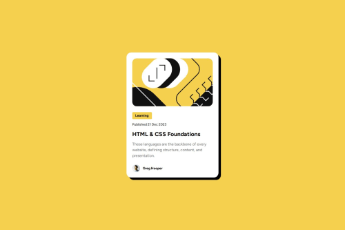
I think that I got the design to match almost perfectly in the desktop size. I still feel the text is a little off and I cannot exactly figure out why but overall I am happy with how it turned out.
What challenges did you encounter, and how did you overcome them?The biggest challenge for me was making the design responsive. I ended up using a media tag with a max-width of 450px in order to make the changes for mobile size.
What specific areas of your project would you like help with?I would like help with making my designs responsive and figuring out best practices there.
Code
Loading...
Please log in to post a comment
Log in with GitHubCommunity feedback
No feedback yet. Be the first to give feedback on John Van Schultz's solution.
Join our Discord community
Join thousands of Frontend Mentor community members taking the challenges, sharing resources, helping each other, and chatting about all things front-end!
Join our Discord