Solution retrospective
What are you most proud of, and what would you do differently next time?
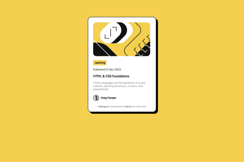
I guess the part where it is responsive. I do not need to use the media rule and adjust it. I have tested it on my phone, and it looks great.
What challenges did you encounter, and how did you overcome them?The SVG element is where I have to center it. The solution that I have thought of is adjusting the width of the parent container.
What specific areas of your project would you like help with?The part when adding animations. I cannot seem to do it where you hover over a text and the container's box shadow will expand it was very hard to understand, and I ended up not doing it.
Code
Loading...
Please log in to post a comment
Log in with GitHubCommunity feedback
No feedback yet. Be the first to give feedback on Hroldddp's solution.
Join our Discord community
Join thousands of Frontend Mentor community members taking the challenges, sharing resources, helping each other, and chatting about all things front-end!
Join our Discord