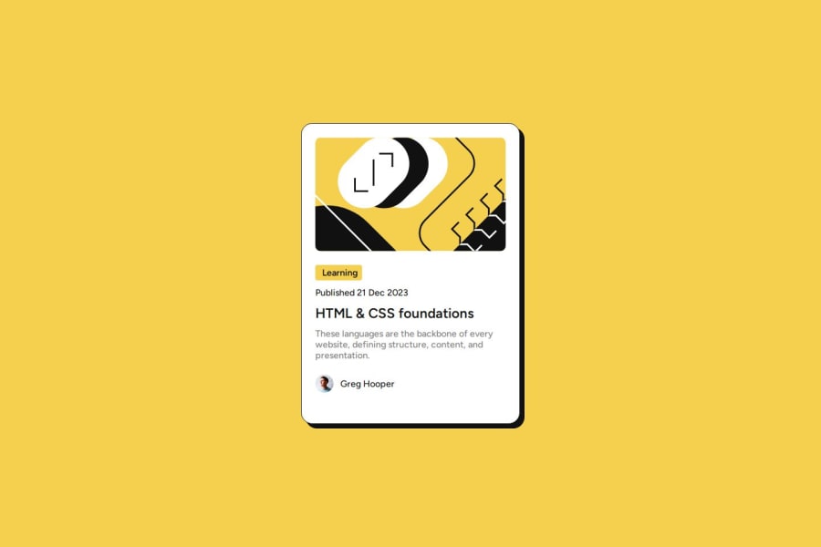
Design comparison
Solution retrospective
I am most proud of the hover effects and animation. The gradient transition turned out exactly as I envisioned, creating a visually appealing effect that enhances user interaction. Next time, I would focus more on optimizing the CSS code and ensuring it is more modular. I would also invest more time in improving the accessibility of the project, making sure that it is fully usable by people with disabilities.
What challenges did you encounter, and how did you overcome them?One of the main challenges I encountered was ensuring that the card was fully responsive on different screen sizes. Initially, I struggled with maintaining the layout on smaller screens. I overcame this by adopting a mobile-first workflow and using flexbox for more control over the layout. I also faced issues with the hover effects not working as intended, which I resolved by experimenting with different CSS properties and researching best practices.
What specific areas of your project would you like help with?I would appreciate feedback on the following areas:
CSS Structure: Are there any suggestions for improving the structure and organization of my CSS?
Accessibility: Are there any accessibility improvements I could make to ensure a more inclusive design?
Performance: Any tips on optimizing the performance of the card, especially concerning CSS and image loading?
Any advice or suggestions on these points would be greatly appreciated!
Community feedback
Please log in to post a comment
Log in with GitHubJoin our Discord community
Join thousands of Frontend Mentor community members taking the challenges, sharing resources, helping each other, and chatting about all things front-end!
Join our Discord
