Solution retrospective
What challenges did you encounter, and how did you overcome them?
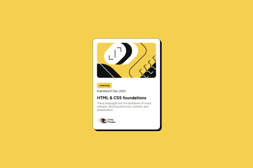
not sure if I structured it correctly, and paddings and margin, I dont know if they are correct or exact like in pictures
Code
Loading...
Please log in to post a comment
Log in with GitHubCommunity feedback
No feedback yet. Be the first to give feedback on Arthur Schossler Dutra's solution.
Join our Discord community
Join thousands of Frontend Mentor community members taking the challenges, sharing resources, helping each other, and chatting about all things front-end!
Join our Discord