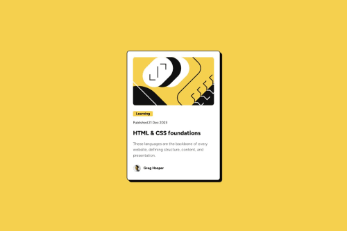
Submitted about 1 year agoA solution to the Blog preview card challenge
Blog Preview Card
@naveenkkannan

Solution retrospective
What are you most proud of, and what would you do differently next time?
I am proud to note that I nearly achieved the desired spacing between elements. In future projects, I will explore alternative methods for spacing to enhance the layout further.
What specific areas of your project would you like help with?I am seeking assistance with achieving precise spacing between elements. I am having difficulty extracting accurate information regarding element spacing and would like to verify whether I have achieved the desired spacing correctly. Guidance on this matter would be greatly appreciated.
Code
Loading...
Please log in to post a comment
Log in with GitHubCommunity feedback
No feedback yet. Be the first to give feedback on Naveen K's solution.
Join our Discord community
Join thousands of Frontend Mentor community members taking the challenges, sharing resources, helping each other, and chatting about all things front-end!
Join our Discord