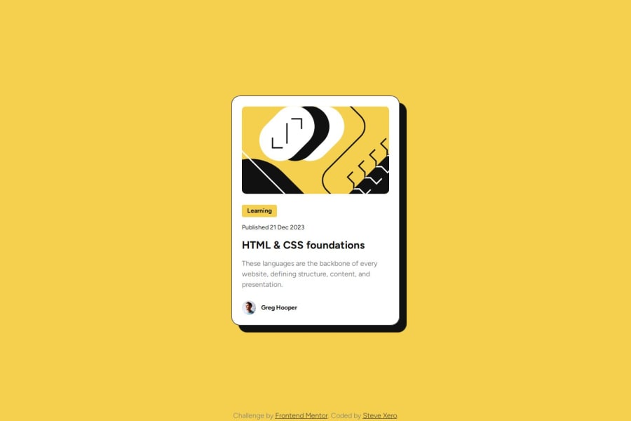
Blog Preview Card - focusing on relative units


Design comparison

Solution retrospective
I am most proud of the improvements I'm making towards semantically correct HTML, accessibility, and reusable CSS variables.
What challenges did you encounter, and how did you overcome them?I ran into a few minute problems, one being that an element I gave a display of inline-block to had some margin on it, even though I had all margins and paddings reset. It had to do with a vertical-align property that is automatically set to baseline. I was able to fix it by setting it to top.
What specific areas of your project would you like help with?The main focus of this project was to use relative units as opposed to fixed pixel sizes. I was trying to keep the solution as close to the design as possible, resulting in some crazy rem's, like 0.875rem. Is this ok?
Please log in to post a comment
Log in with GitHubCommunity feedback
- @Mirjax2000
Hi. checked your solution. From readme as well. what i liked - tooltips on anchor and figure and figcaption.
and if i may - you made breakpoint on 768 px. But only text changes. Mobile version is not worknig at all, width of the card should be smaller and picture should keep aspect ratio on same height 200px. Did you use figma or sketch design? and i also saw that on that mediaquery you made tons of changes on your --root variables. You dont need to that this way.
I try to explain but it is compilicated. I always scare use EM units, instead i used REM units as you do now. But EM units is your best friend. It is important to understand this concept. every element has its context, that context is by font-size. so if i declare font size to H1 lets say to 24px/16 = 1,5 REM 16 is context and 24 is target. and i use EM units on padding,margins, borders, border, radius, on width and hight as well and everything what has something to do with size: Calculation will be different now , i want make padding around H1 16px all sides. target is 16 but context is 24 from my font size in H1 element so target/context= EM unit, 15/24 = 0,6666 EM. From now on when you change font size on mediaquerie, you need change only font size and everything what has something to do with H1 element inside will change properly. I made function in Sass that calculate em units for me. I need only to know what size i want and what contaxt i am in. and you dont need to declare so many variables in --root and if so you dont need to adjust so many variabels in mediaquery.
But be carefull you need to know context all the time, bicouse if you declare font size as a parents, children EM units must be udjusted by code, coz to your childeren EM units increase by 100% to another children another 100% so i make little comment on every font-size: 2 REM//32px and then i know my context in element or context of my parrent. And you can check your developer console as well, click on the font size and it will show you.
As i said above, i did not use to use EM units but one day i realize how strong tool it is. and the i use it. It is like in factorio game. you make small automatizations to great one.
I still working on the recipe challenge. I choose realy something complicated, but it mus be done, later on i will meet that problem on bigger projects and now i can practise it. It is a pain in the ass, you will see.
little hint "resolution switching" and "Picture art" techniques, it will save bandwith and also wil show better quality imiges on retina displays.
Bye
Marked as helpful - P@stevexero
Hey! Thanks so much for your feedback! Check my code now, I did my best to implement what you're talking about, checked with different scales by setting
html {
 font-size: 500%; /* 200%, 300%, 400%, etc. */
}
I got a nice view of how to make things work for accessibility.
I'd like to point out a few things, if that's ok...
My a11y mentor Corina sent me this article about refraining from using relative units for margins, padding, and other spacing techniques as the focus is to modify the important content for the user to read or interact with. It's a great read!
I understand what you're saying about ems vs rems, and the best way I can make it make sense is by referring to inheritance. Every child element inherits it's parent's properties, so in the case of rem, it inherits from the root, while em inherits directly from it's parent.
I did use Figma, and did have my max-height set to 200px. I checked out your solution as well and kind of had the same question, as I see there's no border-radius on the pill tag.
I need to dig deeper into "little hint "resolution switching" and "Picture art" techniques, it will save bandwith and also wil show better quality imiges on retina displays."
Thank you again for your feedback! I am going to revisit my other challenges and apply what I'm learning, but I've also starting the second learning path and, funny enough, it's about responsive media.
How's the recipe page coming along?

Join our Discord community
Join thousands of Frontend Mentor community members taking the challenges, sharing resources, helping each other, and chatting about all things front-end!
Join our Discord