

Design comparison

Solution retrospective
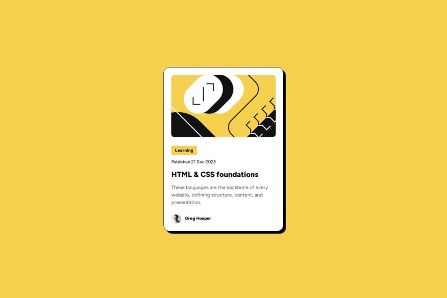
I'm most proud of creating a functional Blog Preview Card purely using CSS and HTML, how I was able to handle the challenge, making it responsive. In the future, I would focus on improving the responsiveness and accessibility of the Blog Preview Card.
What challenges did you encounter, and how did you overcome them?Challenge: Ensuring that the elements aligned correctly, maintained consistent spacing, and captured the essence of a real QR code was a challenge.
Solution: I did multiple iterations of adjusting the borders and spacing to make it look visually accurate.
What specific areas of your project would you like help with?I would like help with media queries or other CSS techniques to scale the code appropriately. Also, on making the CSS flexbox layout responsive, particularly how to adjust the card code size without distorting its pattern. Also i would like help at html sintaxis and semantics structures.
Community feedback
- @Nikhila-DNPosted 5 months ago
Hi @k-hroma,
Your solution for Blog Preview Card, looks excellent
1 - @6Mario13Posted 5 months ago
Well done! I would only change the semantics of some elements like a button which is not a button (you can't submit anything), or change sections to divs. But these are details, and the whole thing looks great
1


Please log in to post a comment
Log in with GitHubJoin our Discord community
Join thousands of Frontend Mentor community members taking the challenges, sharing resources, helping each other, and chatting about all things front-end!
Join our Discord