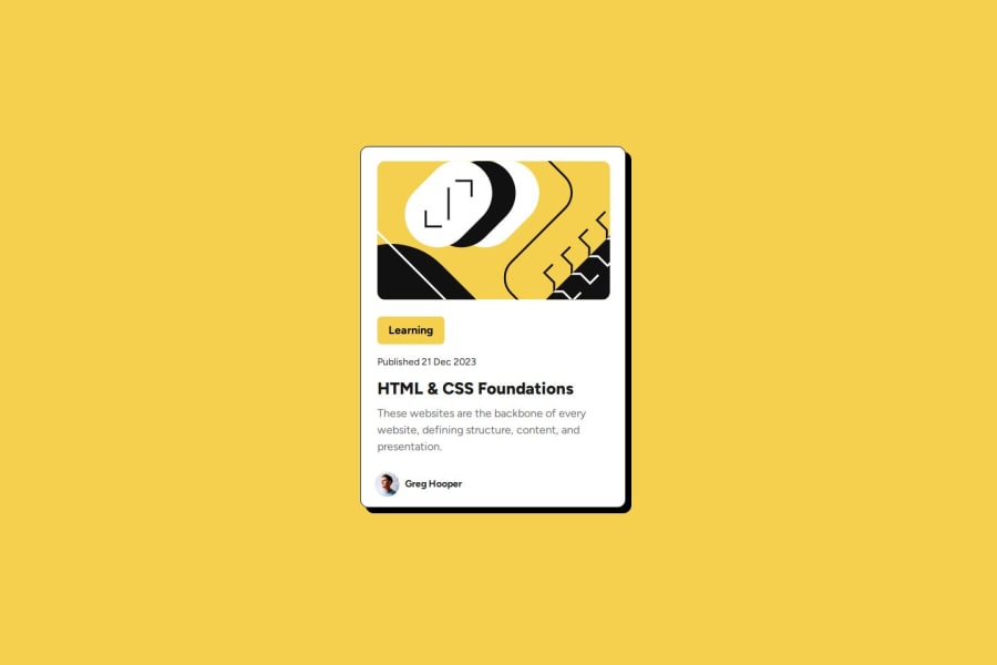
Blog Preview Card First Solution
Design comparison
Solution retrospective
Most Proud of: Being able to make the solution look as close to possible as the original design Do Differently: Using the Figma files to better understand the actual spacing, would have saved time if I used it earlier.
What challenges did you encounter, and how did you overcome them?Challenges: Trying to figure out how to set the normal max width length and have the card width adjust if the screen size is too small. Still working on that.
What specific areas of your project would you like help with?The card widths/max-widths as mentioned in the challenges. My attempts of setting the max-width and max-height followed by using w-full and h-full messed up the cards, not sure what else to do.
Join our Discord community
Join thousands of Frontend Mentor community members taking the challenges, sharing resources, helping each other, and chatting about all things front-end!
Join our Discord
