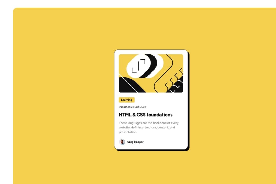
Design comparison
Solution retrospective
I am proud that I got the design really close to the actual design.
What challenges did you encounter, and how did you overcome them?The challenges I encountered in this project were trying to get correct width for the pictures used. I just had to play around with the code to get the width's correct.
What specific areas of your project would you like help with?I want to know how I can create a container for my code that matches the example on frontendmentor.
Community feedback
- @owlbuntPosted 11 months ago
why you want to switch images? it's the same image for all screen bro just take a look at my solution and see what i have done if you still don't understand any part of this feel free to ask I'm here for u - https://owlbunt.github.io/frontEndMentor/blogCard/
and here is source code : https://github.com/owlbunt/frontEndMentor/tree/main/blogCard
Marked as helpful0 - @BlackpachamamePosted 11 months ago
The live site url should be
https://mverma45.github.io/Frontend_Mentor/blog-preview-card-main/Well, here we have some topics:
- The idea is not that your site is an image, you should do the same thing that appears in the design image, but with HTML and CSS. That is, you should create a card equal to the one in the design.
- You have the images (illustration and avatar) in the
assets/imagesfolder
0
Please log in to post a comment
Log in with GitHubJoin our Discord community
Join thousands of Frontend Mentor community members taking the challenges, sharing resources, helping each other, and chatting about all things front-end!
Join our Discord
