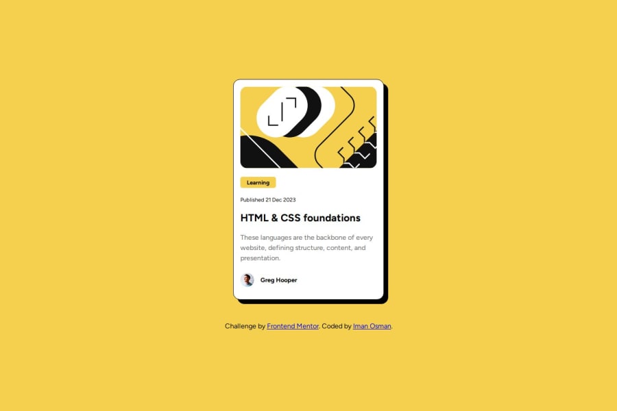
Design comparison
Solution retrospective
This one took me less time than the first. I tried to keep the problems as simple as possible. I'm satisfied with the end result.
What challenges did you encounter, and how did you overcome them?I had a hard time figuring out how to order the items in the stack like the images and different text elements on the card.
I tried to use the order: property but I realised that since I had set body to display: flex;, the section element I used for the card was the flex-item, not the elements within.
When I tried to make a flex container within another by assigning display: flex to section (the card), the problem seemed to become more complicated. So, I just did the simple thing and ordered them the way they appear in the HTML, which wasn't my preference.
How best to address this when ordering flex items in a container?
What specific areas of your project would you like help with?Please advise as to the above. I don't imagine that the best way was to reorder the stack in the HTML, but I couldn't figure out how to make proper use of the order property within flex containers. In a situation like this, would you always assign the flex container to body rather than the card itself? I'm not sure...
Please log in to post a comment
Log in with GitHubCommunity feedback
- @CamrynTidsworth
Great design, looks very close to the original! The code is well-written and easy to read.
I think if you add "display: flex;" to the section element you can then use order on the content inside. I've never done it before so let me know if it does/doesn't work. Out of curiosity, why do you want to have things ordered differently in the HTML? Is it because you want the more relevant headings to get more SEO attention?
One other tip I learned doing this design was how to add hover states to elements. In this instance, to make the title turn yellow and turn the cursor into a pointer you can add this to your existing CSS:
h2:hover { color: yellow; cursor: pointer; }
Marked as helpful
Join our Discord community
Join thousands of Frontend Mentor community members taking the challenges, sharing resources, helping each other, and chatting about all things front-end!
Join our Discord
