Design comparison
Solution retrospective
🌟 Solution Retrospective: Blog Preview Card Component 🌟
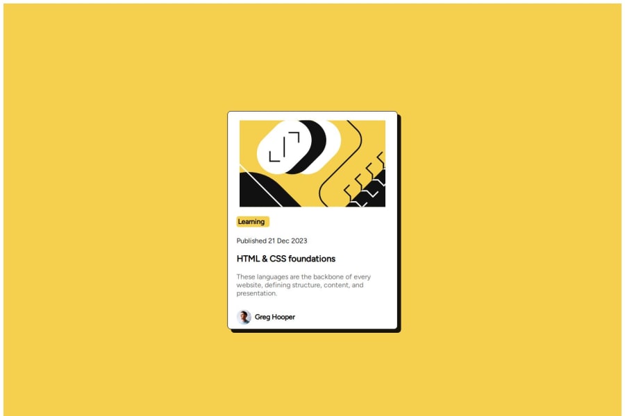
Project Overview As part of my #100DaysOfCode journey, I designed a responsive blog preview card component. The goal was to create a visually engaging card layout that showcases a blog post with clear sections for the title, author profile, and publication date. This component is aimed at providing an accessible and clean preview for users on both mobile and desktop.
Key Learnings and Accomplishments
I enhanced my CSS Flexbox skills to structure the layout, making it adaptable across screen sizes. Experimented with color schemes and box-shadow to add depth and draw attention to the card. Worked with a new font, Figtree, to improve readability and the overall aesthetic. Gained a deeper understanding of responsive design principles, focusing on making each element visually balanced and functional. Areas for Support
I’d love feedback on refining the CSS to make it more efficient and maintainable. Any suggestions on improving accessibility would be welcome, especially with colors and font choices. Tips on further enhancing the card’s responsiveness to handle more complex layouts would be great! Thank you to the community for your support! 💪
Community feedback
- @hubertasGeciauskasPosted 5 months ago
I will share advice which I got recently to good practical advice to do CSS reset and define variables for colors.
0
Please log in to post a comment
Log in with GitHubJoin our Discord community
Join thousands of Frontend Mentor community members taking the challenges, sharing resources, helping each other, and chatting about all things front-end!
Join our Discord
