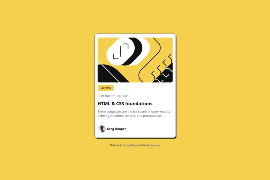
Design comparison
SolutionDesign
Community feedback
- @motuncodedPosted 6 months ago
Congratulations on the completion of your project
Few suggestions to make it better:
- It is a good practice to have the css styles in a css file
- The
<div class='container'>should be changed to<main class='container'>or<div role="main" class="container">to be accessible to screen readers - The heading should be in hierarchy i.e
<h1>><h2>><h3>. This shows that the heading should be ascended order - It is also a good practice to use a formatting package e.g prettier to format the code base.
0
Please log in to post a comment
Log in with GitHubJoin our Discord community
Join thousands of Frontend Mentor community members taking the challenges, sharing resources, helping each other, and chatting about all things front-end!
Join our Discord
