Design comparison
SolutionDesign
Solution retrospective
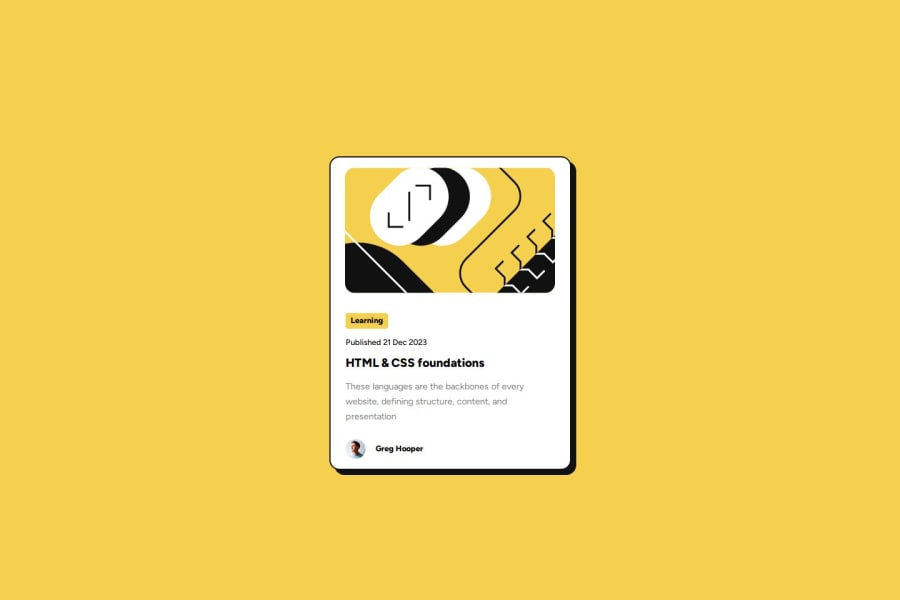
In this challenge I had some difficulties in manipulating the width of the image and the card itself, I directly changed the width of the image using the vw unit, but I believe that my card and image were a little wider and smaller than what was proposed by the design, getting the proportioning elements without the project in Figma is a little more difficult than I thought. If you have comments related to this or any other point in my code, I'll be happy to read them :)
Community feedback
Please log in to post a comment
Log in with GitHubJoin our Discord community
Join thousands of Frontend Mentor community members taking the challenges, sharing resources, helping each other, and chatting about all things front-end!
Join our Discord
