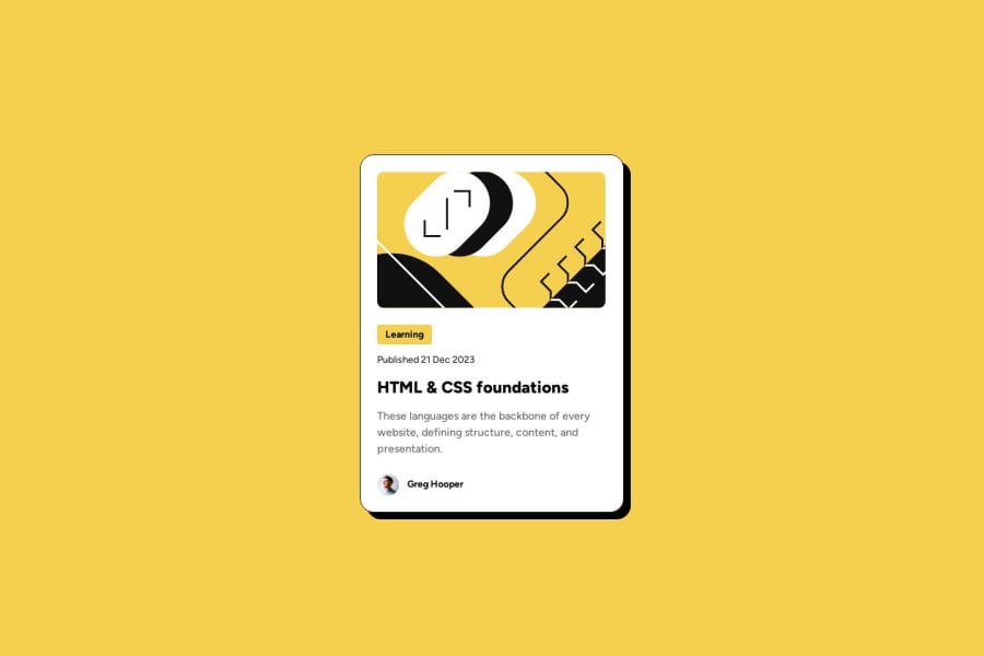
Design comparison
Solution retrospective
This was a very decent revision of all the CSS concepts that I have studied so far. I have now a very strong understanding of Flex box as well as margins, paddings etc.This will essentially help me a lot in future.
What challenges did you encounter, and how did you overcome them?The biggest challenge was probably the alignment of the different components inside the card getting the spacing between them correct as well.
What specific areas of your project would you like help with?I would definitely require help on understanding the responsive design. From the Figma file, I was not able to understand what should be the ideal size of the card in different aspect ratios. Mobile or desktop, so I ended up hard-coding the size.
Please log in to post a comment
Log in with GitHubCommunity feedback
- @Yago14
A solução inclui HTML semântico? sim É acessível? Que melhorias poderiam ser feitas? não O layout fica bom em vários tamanhos de tela? sim O código é bem estruturado, legível e reutilizável? sim A solução difere consideravelmente do design? não
Join our Discord community
Join thousands of Frontend Mentor community members taking the challenges, sharing resources, helping each other, and chatting about all things front-end!
Join our Discord
