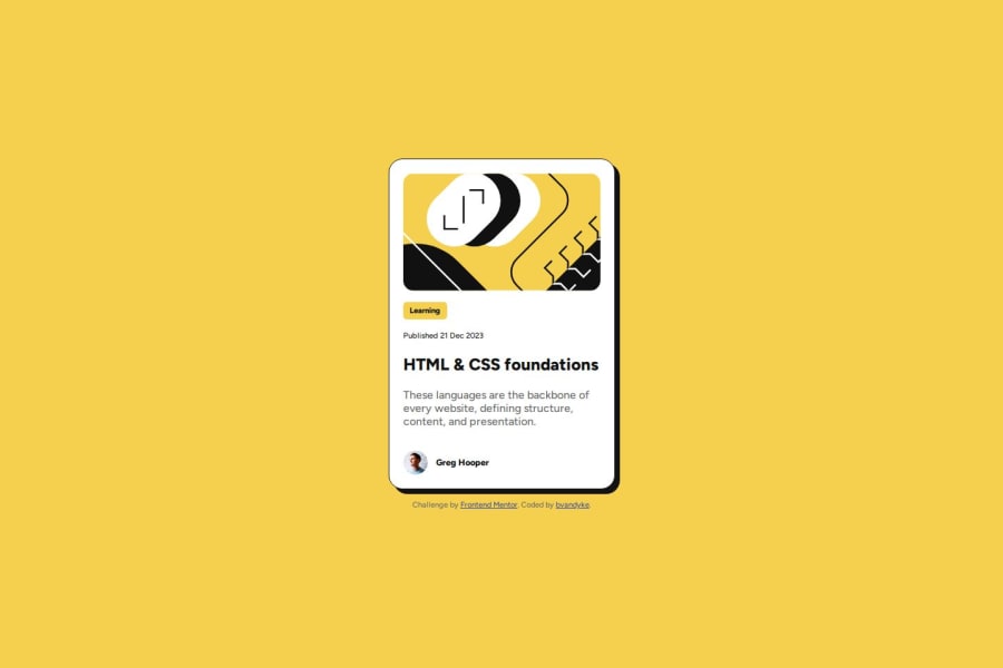


Design comparison

Solution retrospective
Used @layer @rule to organize my styles.
Used modular CSS with BEM. Moved through the project faster, and with more accuracy than before.
Used variable web fonts.
What challenges did you encounter, and how did you overcome them?Made variable web fonts work on the project.
What specific areas of your project would you like help with?I used nested selectors and other techniques, but I'm still unsure about current best practices when it comes to organizing my code.
Community feedback
- P@kaamiikPosted 2 months ago
Some few notes:
- Put all your card content inside a
mainelement and after main you need a footer that you have it already in your code. channge the footer inside yourarticleto a div because It's completely pointless.
- Use a
ptag instead ofspan. And there is no need foraria-label.
- Consider this card is part of a page and in a real scenario we should not use
h1here.h2may be more proper.
- Your top image is decorative so the alt should be empty. Also the profile pictures does not need alt text and you can put empty for that.
- Your font-size is 16px in the root and no need to define it again and never change the font-size in root. The standard is 16px that means
1rem.
- Use
min-height: 100vh;instead ofheight:100vh;.height: 100vhstrictly limits the height to the viewport size, potentially causing overflow issues if the content is larger than the viewport. On the other hand,min-height: 100vhallows your element to grow in height if the content exceeds the viewport size.
- No need for
width: 100%;.
- Never limit your width and height in a container or element or tag that contains text inside.
When you limit the width and height of elements containing text, you risk the text being cut off,
overflowing, or becoming unreadable, especially on smaller screens or when the text dynamically changes.
It's generally better to allow the container to adjust its size based on its content or set a flexible
size that can adapt to different screen sizes and text lengths. You only need
max-widthhere in your.cardbecause it prevents elements from stretching beyond a certain point, keeping them visually appealing across different screen sizes. It ensures your design remains adaptive and doesn't get too wide on larger screens.
- Also your max-width should be in rem unit.
- I've never used
@layerand some other stuff in your code but I'm sure you can write your css without them and they are just overcomplicate your code. make your code easy to read and clean.
Marked as helpful1@ridge-runnerPosted 2 months ago@kaamiik wow, thank you for such a detailed critique!
I've made note of your advice and will use it in future challenges! The points you set out were all blind spots that I've been unsure about for a long time.
0P@kaamiikPosted 2 months ago@ridge-runner You have to first refactor this challenge and then go for next challenge. This is really important.
Marked as helpful1@ridge-runnerPosted 2 months ago@kaamiik ok, I'll refactor it before moving on to further challenges. Thanks again for your time and concern!
1 - Put all your card content inside a
- @GERB-DEVELOPERPosted 2 months ago
Se aprecia un buen conocimiento de semántica así como el uso del diseño responsivo. Su código Html simple pero efectivo, cumplo con lo solicitado así como la practicidad del código css.
1@ridge-runnerPosted 2 months ago@raymar73 Gracias! Estoy intentando tomar las cosas paso a paso.
0


Please log in to post a comment
Log in with GitHub
Join our Discord community
Join thousands of Frontend Mentor community members taking the challenges, sharing resources, helping each other, and chatting about all things front-end!
Join our Discord