Design comparison
Solution retrospective
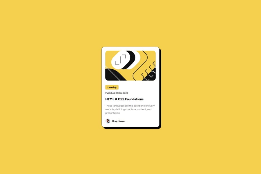
This time, I tried a new workflow. I decided to commit when an element of UI is completely finished. For example when the HTML and CSS of the tag "Learning" was done. I really liked it so I will continue with this workflow. I also managed to use quickly and correctly box-shadow for the shadow of the card. I did check Google for its syntax though.
What challenges did you encounter, and how did you overcome them?The main challenge was to remember the syntax of box-shadow. So I checked on Google, find the MDN article on it, and use its syntax to make the shadow like in the design.
What specific areas of your project would you like help with?If you want to provide a feedback, don't hesitate to answer those questions :
- Did I followed correctly the "best practices" while coding HTML and CSS ?
- What do you think of my code in globality ?
- Do you have any advice or recommendation to share ?
Community feedback
- @AhirgautamPosted 5 months ago
nice implementation of challenge but you could improve some things
- wrap whole card into main element
- use of css variable for color
- applying min-height:100vh instead of height:100vh on body
- use of rem and em unit for font sizing
Marked as helpful1@SephydevPosted 5 months ago@Ahirgautam Hi thanks for your reply !
- Yup it's a good idea. I don't know why I didn't think of that while I was doing this project.
- I don't have the habits of using css variable, but I will try to use them on the next projects !
- I totally forgot about the min-height property. Thanks for reminding me that !
- Generally I use rem for font-sizing. I don't know why I didn't use that this time.
I will fix all of that when I can. Again, thanks for your reply !
1 - @MehmetAydar01Posted 5 months ago
good job 👏
1
Please log in to post a comment
Log in with GitHubJoin our Discord community
Join thousands of Frontend Mentor community members taking the challenges, sharing resources, helping each other, and chatting about all things front-end!
Join our Discord
