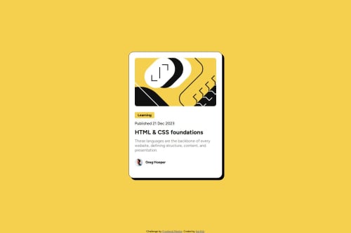
I recommend you refactor this by applying learnings from your next few challenges and the feedback you've received. You should be able to improve this quite a bit now.
Note
- it is overflowing my mobile screen on the sides
- there is currently no interactive element so people would be unable to ever access this blog if it was on a real site.
- inline svgs like this need
focusable="false"
as some screen readers will focus on svgs (annoyingly!) - inline svgs either need aria-hidden (if a decorative image) or they need an accessible name (if meaningful content).
- h1s are for page headings but a component like this is a signposting component. It would never act as the page title on a real site.
@karthikganesanTR
Posted
@grace-snow Thanks for suggestions. i have refactored based on few of your suggestions. Please see if the overflow still exist on your mobile
@karthikganesanTR sorry, this still has problems.
You've misunderstood and over-complicated a few bits actually:
- don't change aria-level on the heading! If this was used on a page listing blogs it would result in loads of h1s on a page and be hard to understand the content.
- the alt on the avatar needs to be unique to that image. Same issue in a way... "Avatar" is not descriptive of an image yet every blog card would have that alt description.
- height 100vh is causing the whole card to get cut off at the top in some screen sizes/orientations. Use min-height so elements are not limited to the height of the viewport.
- this challenge should not have any media query, you can delete all of that. The card simply needs a max width in rem so it can shrink narrower when it needs to. I say to use rem there so the layout scales correctly for all users, including those with a different default text size. (Also note for future, if using media queries, you'd place the larger screen style changes in there and keep mobile styles as the default, and you.wouod need to define media queries in rem or em not px — I've written about this on FEDmentor.dev if you want to take a look)
Some minor css suggestions too
- it's better for performance to link fonts in the html head instead of css imports.
- try to get into the habit of including a full modern css reset at the start of the styles in every project. It will make your life easier. Andy Bell or Josh Comeau both have good ones you can look up and use.
Marked as helpful
@karthikganesanTR
Posted
@grace-snow.
- Thanks for pointing it out, accessibility report says page should have h1 element. so, tried to make h2 it as h1 to clearing warning on the report
- Regarding min-height vs height, m not clear on
min-height: 100vh
not cutting on top (but actually touching the top) butheight: 100vh
cutting on top. can provide some reference on this topic - Regarding not to use media queries, i have replaced with max-width as rem. How to make sure very developing closer to the design or we can tradeoff on something in the design. (both mobile and desktop)
- In my laptop, card is touching the edges of screen at certain screen sizes - is this due to content and spacing. To fix, i have added
margin: 1.5rem
in the container, is this correct
@karthikganesanTR
- the warning is only because an automated scan assumes this is a full Web page, not a single component. It does not need a h1.
- you can replicate the issue on small phones in landscape mode. It's a key difference - height is a fixed value, that's like setting a limit "it must be this exact height". Min-height is saying "make it at least this height", this allowing the element to be taller if and when needed to fit the content in.
- I don't understand the question about media queries... Are you saying the figma design has different font sizes on mobile so is needed for that?
- it's fine to add margin to components but unlikely to be the correct approach for this on a card, because it's often placed in a grid where gap would be used on a real page. I would choose to add some padding on a wrapping element (like the body or main) in this kind of component demo instead.
@karthikganesanTR
Posted
@grace-snow
- Yes. figma design has different font-sizes on mobile version.
@karthikganesanTR man, that's annoying and unnecessary! 😂
I'm that case, it's fine to have a media query. Or use clamped font sizes like those generated by Utopia