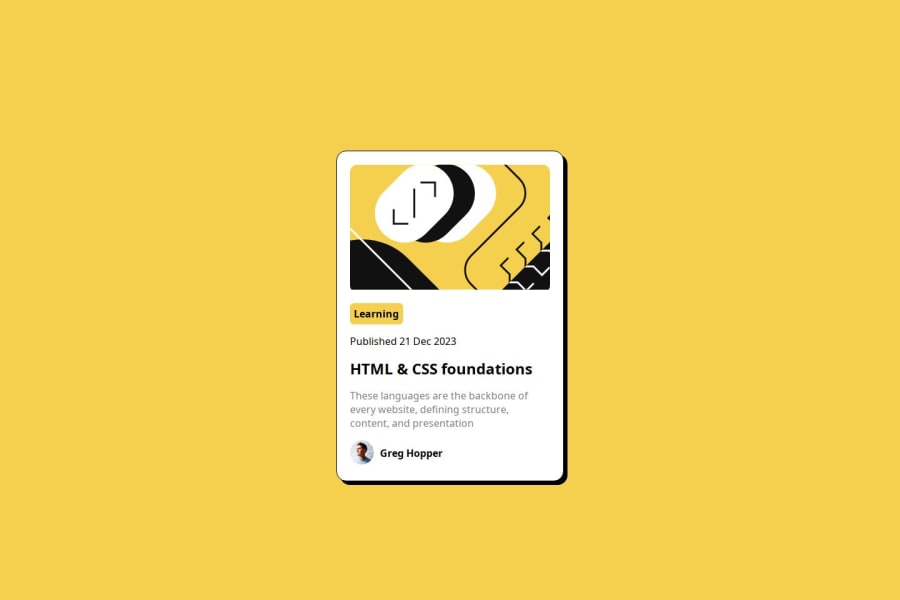
Blog preview card component challenge solution


Design comparison

Solution retrospective
I am most proud of finishing the challenge, and being able to submit me solution.
What challenges did you encounter, and how did you overcome them?No challenge
What specific areas of your project would you like help with?I don't know
Community feedback
- @StroudyPosted 2 months ago
Amazing job with this! You’re making fantastic progress. Here are some small tweaks that might take your solution to the next level…
- At 716px screen size your card begins to break, Add this to your
#flex-containerto solve the issue
margin: auto; max-width: 20rem;-
Avoid using
idselectors for styling in CSS because they are too specific and hard to override, making your styles less flexible and maintainable. Instead, use class selectors (.), which are reusable and more manageable, allowing for better control over your styles and easier updates. -
Using
remoremunits in@mediaqueries is better thanpxbecause they are relative units that adapt to user settings, like their preferred font size. This makes your design more responsive and accessible, ensuring it looks good on different devices and respects user preferences. -
This does not matter that much at this stage but something to be mindful of for SEO(Search Engine Optimisation),
<meta>description tag missing that helps search engine determine what the page is about, Something like this<meta name="description" content="" /> -
Using a
<main>tag inside the<body>of your HTML is a best practice because it clearly identifies the main content of your page. This helps with accessibility and improves how search engines understand your content.
You’re doing fantastic! I hope these tips help you as you continue your coding journey. Stay curious and keep experimenting—every challenge is an opportunity to learn. Have fun, and keep coding with confidence! 🌟
Marked as helpful0@1NonsoPosted 2 months agoThank you for all you've said, ill do my best to implement and take note of your corrections @Stroudy
0@1NonsoPosted 2 months agoIn that meta description tag what should i write inside content?? @Stroudy
0 - At 716px screen size your card begins to break, Add this to your

Please log in to post a comment
Log in with GitHub
Join our Discord community
Join thousands of Frontend Mentor community members taking the challenges, sharing resources, helping each other, and chatting about all things front-end!
Join our Discord