Not Found
Not Found
Not Found
Not Found
Not Found
Not Found
Not Found
Not Found
Not Found
Not Found
Not Found
Not Found
Not Found
Not Found
Not Found
Not Found
Not Found
Not Found
Not Found
Not Found

Submitted

Blog preview card component

Roberto Rojasā€¢ 90

@roberto-rojas-dev

Desktop design screenshot for the Blog preview card coding challenge

This is a solution for...

  • HTML
  • CSS
1newbie
View challenge

Design comparison


SolutionDesign

Solution retrospective


What are you most proud of, and what would you do differently next time?

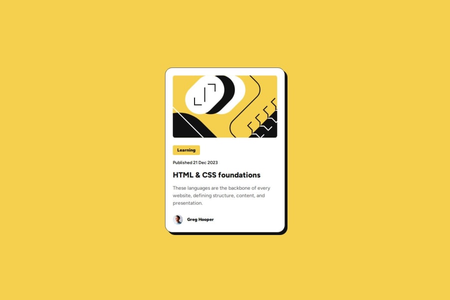
I loved the style of this card. It was a fun challenge to code.

What challenges did you encounter, and how did you overcome them?

I was trying to find a way to set the spacing for all the different elements using fewer lines of code. However, it seems that the distances between some of them are different and unrelated, so I had to set different margin-bottom values for multiple elements.

Is there a better approach for this? Considering that using something like gap or margin-block wouldn't give the desired result since each distance is slightly different.

What specific areas of your project would you like help with?

I would really like to get feedback on my use of semantic HTML tags. Iā€™d also appreciate any advice related to good CSS practices.

Thank you so much for reading. I hope you have an amazing day/night šŸ’œāœØ

Community feedback

Darkstarā€¢ 1,000

@DarkstarXDD

Posted

Looks good.

  • The spacing between the elements are same in this design. So you can use the gap property without any issues. If somehow the spacing was different, and the difference was like 1px or 2px i would ignore it and still use the gap property. Sometimes designs can have inconsistencies. However, in this design the spacing is same. I checked the Figma file.
  • I see you are using values like 16.8px, 15.4px. You most probably never will use broken values like these in actual production. 16.8px is 16px. I assume you don't have access to the Figma file and you may have guessed the values. It's totally fine. Just round the value to the nearest value you feel like.
  • The "HTML & CSS" is a heading in this design. It's an <a> inside a heading.
  • The text should be in a meaningful element like a paragraph tag <p>. Text alone inside a <span> or <div> is not recommended since neither of them are meaningful elements. You can replace all those span tags with p tags.
  • In this design the whole card should be clickable. Not only the "HTML & CSS" part. Try to make it to work. You will need to use a pseudo element on the <a> for that.

Marked as helpful

0

Roberto Rojasā€¢ 90

@roberto-rojas-dev

Posted

@DarkstarXDD Thank you so much for the advice, I'll fix it right away.

Hope you have an amazing day āœØ

1

Please log in to post a comment

Log in with GitHub
Discord logo

Join our Discord community

Join thousands of Frontend Mentor community members taking the challenges, sharing resources, helping each other, and chatting about all things front-end!

Join our Discord