

Design comparison

Solution retrospective
proud of : turned out how I wanted it to with no issues
need support on: naming my html classes I am not good at it and would like to improve for clarity
What challenges did you encounter, and how did you overcome them?issues : trouble getting the on hover transition to work but figured it out eventually
What specific areas of your project would you like help with?the comment on classes, help with that would be great, best naming conventions?
Community feedback
- P@MattPahutaPosted 8 months ago
Hi there. Nicely done completing this challenge. Your finished product is a close match to the design comp and you're using a lot of semantic element tags properly. Also good work with your use of custom properties and responsive units.
Regarding the naming of CSS classes, this is often a challenge for devs. For some good insight on the topic, check out this video from Kevin Powell.
Here are few other things I flagged:
- You should always have a
mainelement on the page. Nest the div with the class name of 'main-container' within amaintag. Then, for clarity, you might consider renaming the 'main-container' class to 'card'. - Since this is a card component that would sit along similar components on a page, it would likely never serve as the page title. Semantically, the heading should be an h2 instead of an h1 (even though the formatter will give you a warning about it).
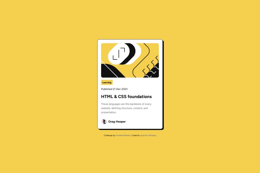
- Your alt text for the image should just be 'Greg Hooper' or even something like 'Greg Hooper's avatar'. Image descriptions should not include words like 'image' or 'picture' because they are already an image role.
- You should have at least one fallback font where you have your font-family set.
- Remove that width from your card component ('main-container'). Give the body some padding instead and stick with max-width only on the card (but probably update that to use rem units instead of pixels).
- I think it's generally preferred to use unitless values for line-heights, but that might be debatable.
- You should avoid using percentages for margin and padding values. Stick with rems, ems, or even pixels.
Again, good work on this project. Good luck moving forward. Cheers!
Marked as helpful1@DivinitryPosted 8 months ago@MattPahuta
Hello Matt,
thank you a lot for the feed back I really appreciate it, will put these comments to good use. Will watch the video and put these tips to use, thank you!
0 - You should always have a
- P@MikDra1Posted 8 months ago0
- P@MikDra1Posted 8 months ago
If you want a quick tip here is a shorter method to center things in the container
On the container :
display: grid; place-items: center;
0 - @tushar-RuhelaPosted 8 months ago
yes,this solution include semantic html and this is accessible the improvement should made like fon weight is not right and height and width also little bit different yes layout can look good on a range of screen size .this is plus point yaa but i am not fully sure but depend upon person to person .if any one want see how this code were made so its okk not any problem. not at all but same as design
0


Please log in to post a comment
Log in with GitHubJoin our Discord community
Join thousands of Frontend Mentor community members taking the challenges, sharing resources, helping each other, and chatting about all things front-end!
Join our Discord