Not Found
Not Found
Not Found
Not Found
Not Found
Not Found
Not Found
Not Found
Not Found
Not Found
Not Found
Not Found
Not Found
Not Found
Not Found
Not Found
Not Found
Not Found
Not Found
Not Found

Submitted

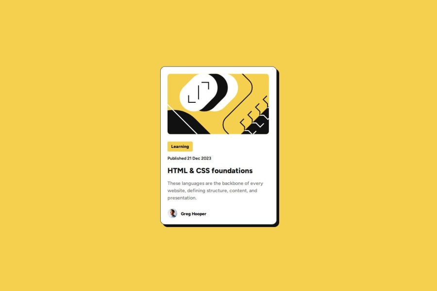
Blog preview card. Coded with SASS, BEM, Grid, Flexbox, Semantic HTML.

@jiricmiel

Desktop design screenshot for the Blog preview card coding challenge

This is a solution for...

  • HTML
  • CSS
1newbie
View challenge

Design comparison


SolutionDesign

Solution retrospective


What are you most proud of, and what would you do differently next time?

I've tried to use semantic HTML and BEM using SASS.

What challenges did you encounter, and how did you overcome them?

Using BEM I often overthink things. I needed to go back again and rewrite it few times. Sometimes output was not as I expected. I double checked everything with developer tools and fixed the problems. Mostly it was adding padding and margins to inline elements without realizing it.

What specific areas of your project would you like help with?

I'd like someone to check my semantic HTML. I'm not really comfortable with it yet and I'm not sure if I used it right. Any help on that topic is welcome. Also reviewing code in general would be highly appreciated.

Community feedback

@CatalinaF-S

Posted

Hi! Here my feedback to your project :)

  • Does the solution include semantic HTML? Yes, I see that you have used semantic elements to organize your HTML code.

  • Is it accessible, and what improvements could be made? In general you solved the challenge in a very structured way and I don't see anything you should improve or change.

  • Does the layout look good on a range of screen sizes? The layout look good but I am not sure that you have implemented a responsive solution.

  • Is the code well-structured, readable, and reusable? I find really cool how you modularized in components your scss code.

  • Does the solution differ considerably from the design? Your solution is very close to the design proposed in the challenge.

0

@jiricmiel

Posted

Hello @CatalinaF-S, thank you very much for your feedback. I feel honored that you invested a bit of your time in me. You're kinda right about not implementing responsive solution. My workflow is desktop first and from that point of view everything works just fine up until 384px. But I see your point and I made one querry for that resolution so that borders of my card are not touching the sides. I'm gonna repay you the kindness and give you some feedback :-)

0
P
Juan Gomez 260

@newbpydev

Posted

Hi fellow developer, You seem to have encountered the same problem that I have come across which is the naming of the classes especially using BEM, on most of my projects I try to follow these guidelines:

  • Use more descriptive element names: Ensure each element's name clearly describes its purpose.
  • Avoid unnecessary abbreviations: Use full words for better clarity.
  • Ensure consistency in naming: Maintain a consistent naming pattern throughout the code.

I have these tips written down on my corkboard so I don't forget to use them on my projects, they might come in handy. Good luck on your journey.

0

@jiricmiel

Posted

@newbpydev thank you very much for your comment. I see BEM as pretty useful but I often get lost while using it. I'll try to stick to your advice. Thx once again.

0

Please log in to post a comment

Log in with GitHub
Discord logo

Join our Discord community

Join thousands of Frontend Mentor community members taking the challenges, sharing resources, helping each other, and chatting about all things front-end!

Join our Discord