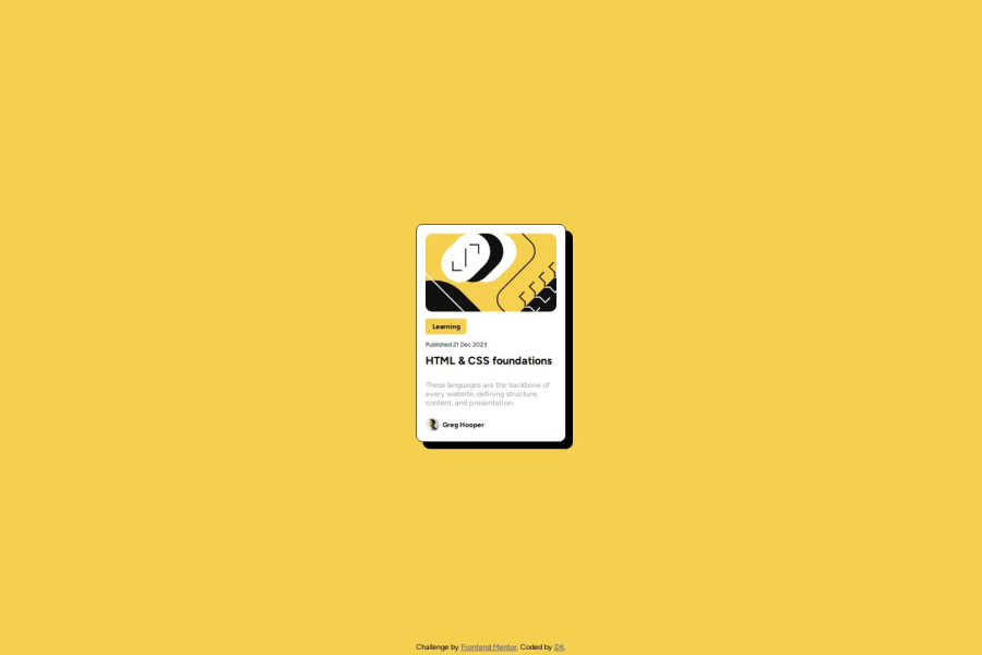
Design comparison
Solution retrospective
I'm proud that I could put this all together.
What challenges did you encounter, and how did you overcome them?One thing I struggled with was making sure that the card class (the white background) would flex to stretch to the content inside of it, which I somehow managed to figure out. It also took me a bit of time to figure out putting elements horizontally with each other the different display settings, one of which I still am a bit confused about is in-line flex.
What specific areas of your project would you like help with?I think I need to spend more time understanding flexbox and how to align elements exactly how I want.
Community feedback
- @AshlavaDevPosted about 1 year ago
You have the layout spot-on. There are some things you might want to look into, if you haven't already. The CSS gap property is great for flexbox as it can help set the spaces between elements to what you want it.
Another great resource that I have bookmarked is the CSS Tricks article on flexbox. The Article
Marked as helpful0
Please log in to post a comment
Log in with GitHubJoin our Discord community
Join thousands of Frontend Mentor community members taking the challenges, sharing resources, helping each other, and chatting about all things front-end!
Join our Discord
