Submitted 7 months ago
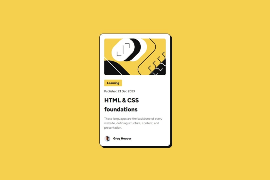
Blog Preview Card Challenge
#react#typescript#vite
@ronaldyonggi
Design comparison
SolutionDesign
Solution retrospective
What are you most proud of, and what would you do differently next time?
I'm starting to get the hang of CSS, it doesn't seem as bad as I thought. Although this is just my second project on this whole FE Mentor platform. Next time I'll try to see if I can incorporate more animations.
What challenges did you encounter, and how did you overcome them?Took me a bit to figure out the animation and box shadow part. Had to look around on the internet and asked AI for some guidance.
Community feedback
Please log in to post a comment
Log in with GitHubJoin our Discord community
Join thousands of Frontend Mentor community members taking the challenges, sharing resources, helping each other, and chatting about all things front-end!
Join our Discord
