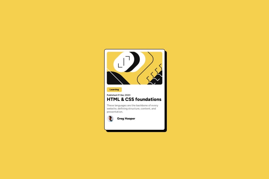
Design comparison
Solution retrospective
All feedback's are welcome. Thank you
Community feedback
- @danielmrz-devPosted 11 months ago
Hello @prithiviraj275!
Your solution looks great!
I have a few suggestions for improvement:
- First: For semantic reasons, and since that is the main title of the screen, you can replace the
<h2>with<h1>.
The
<h1>to<h6>tags are used to define HTML headings.<h1>defines the most important heading.<h6>defines the least important heading. Only use one<h1>per page - this should represent the main heading/subject for the whole page. Also, do not skip heading levels - start with<h1>, then use<h2>, and so on.- Second: Still about semantic HTML, you can replace your
section.containerwithmain.container.
All these tag changes may have little or no visual impact but they make your HTML code more semantic and improve SEO optimization as well as the accessibility of your project.
- Third: Add a
hover effecton the title to indicate that's a clickable element. Something like this:
h1:hover {
  color: yellow;
  cursor: pointer;
}
I hope it helps!
Other than that, great job!
Marked as helpful0@prithiviraj275Posted 11 months ago@danielmrz-dev Thanks a lot daniel, This feedback is very helpful, and I will apply all these changes.
1 - First: For semantic reasons, and since that is the main title of the screen, you can replace the
Please log in to post a comment
Log in with GitHubJoin our Discord community
Join thousands of Frontend Mentor community members taking the challenges, sharing resources, helping each other, and chatting about all things front-end!
Join our Discord
