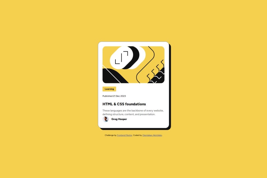
Design comparison
SolutionDesign
Solution retrospective
What are you most proud of, and what would you do differently next time?
I'm proud of how I'm able to convert and set the font-sizes, width and height as designed in the Figma file to CSS relative units. I would like to examine the designed better in Figma before jumping into CSS styling.
What challenges did you encounter, and how did you overcome them?When setting the width and height for img tag there are no changes until I set the display property to block, the initial value was inline.
What specific areas of your project would you like help with?Anything i can do to make it better.
Community feedback
Please log in to post a comment
Log in with GitHubJoin our Discord community
Join thousands of Frontend Mentor community members taking the challenges, sharing resources, helping each other, and chatting about all things front-end!
Join our Discord
