

Design comparison

Solution retrospective
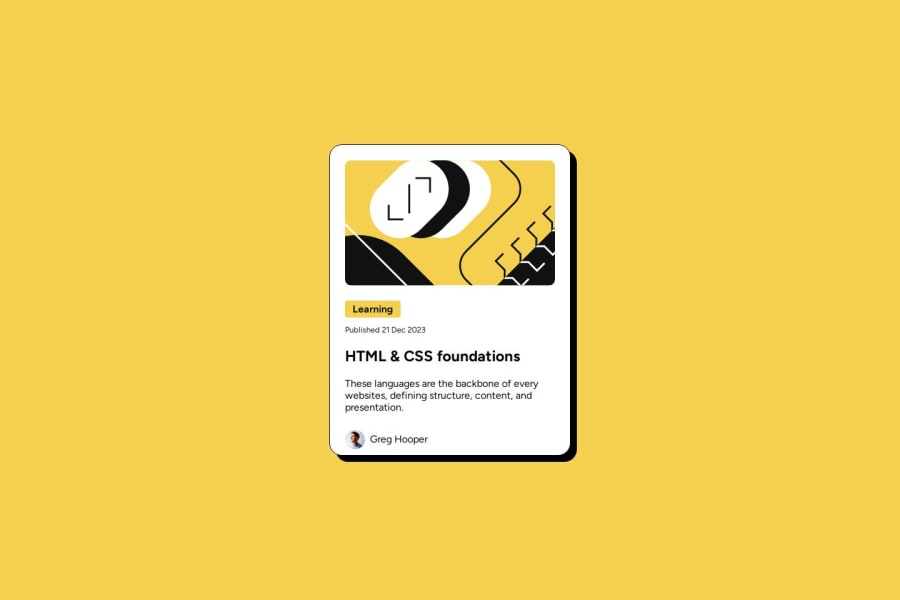
The margin of the image is my weak point, I do not know how to reponsively change the top and bottom margin of the image to be as same as the left and right margin.
Also, the responsivenes of this is also the weak point for me, How can I improve the responsiveness and is there any practical or common approach for this?
What specific areas of your project would you like help with?The margin of the image is my weak point, I do not know how to reponsively change the top and bottom margin of the image to be as same as the left and right margin.
Also, the responsivenes of this is also the weak point for me, How can I improve the responsiveness and is there any practical or common approach for this?
Community feedback
- P@apardolPosted 30 days ago
Hi timothyho512, you should try to apply padding to the parent element, in this case .card, instead of applying left/right margin to each element inside.
Marked as helpful0

Please log in to post a comment
Log in with GitHubJoin our Discord community
Join thousands of Frontend Mentor community members taking the challenges, sharing resources, helping each other, and chatting about all things front-end!
Join our Discord