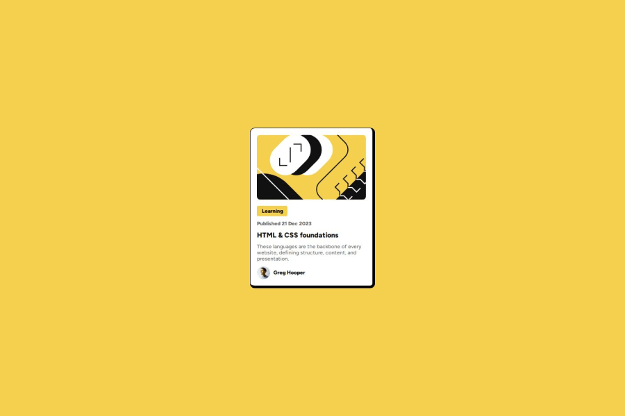
Design comparison
Solution retrospective
I am happy that I was able to do this without using the internet for help. Was able to u se flexbox properties and get most of the outline done very fast. This did not take long but also I could have done it faster.
What challenges did you encounter, and how did you overcome them?The "Learning" title with the yellow background. I am not sure if I did the best approach, as the yellow background width was taking up the whole line. I manually entered a width.
Community feedback
- @abdelrhman-mahmoud-awadPosted 9 months ago
The blog preview card project looks clean and well-structured. The responsive design using CSS Grid and Flexbox is effective. For further improvement, consider refining CSS for better performance and enhancing accessibility features. Additionally, incorporating JavaScript for interactive elements could boost user engagement. Great job on deploying it on Netlify for easy access!
0
Please log in to post a comment
Log in with GitHubJoin our Discord community
Join thousands of Frontend Mentor community members taking the challenges, sharing resources, helping each other, and chatting about all things front-end!
Join our Discord
