

Design comparison

Solution retrospective
When it came to my text I was using header tags. I'd probably use either semantic html or setup tags for each section and style the font size and weight on my own.
What challenges did you encounter, and how did you overcome them?The two issues I ran into:
- Setting up the user avatar and name alignment and size.
- setting the solid border box to be only right and below
Community feedback
- @StroudyPosted about 1 month ago
Exceptional work! You’re showing great skill here. I’ve got a couple of minor suggestions that could make this stand out even more…
- Your heading elements
<h1><h3><h2>, Heading elements should be in sequentially-descending order (e.g.,<h1>,<h2>,<h3>) to create a clear content structure, improving accessibility and SEO. Skipping levels or using them out of order can confuse screen readers, affect search engine rankings, and make your content harder to understand.
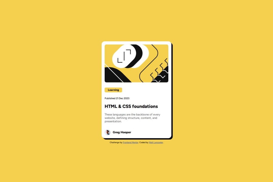
<h5>Learning</h5> <h6>Published 21 Dec 2023</h6> <h3>HTML & CSS foundations</h3>- Having a clear and descriptive
alttext for images is important because it helps people who use screen readers understand the content, making your site more accessible. It also improves SEO, as search engines usealttext to understand the image's context, helping your site rank better, Check this out Write helpful Alt Text to describe images,
<img class="avatarImg" src="assets/images/image-avatar.webp">-
Using a full modern CSS reset is beneficial because it removes default browser styling, creating a consistent starting point for your design across all browsers. It helps avoid unexpected layout issues and makes your styles more predictable, ensuring a uniform appearance on different devices and platforms, check out this site for a Full modern reset
-
While
pxis useful for precise, fixed sizing, such asborder-width,border-radius,inline-padding, and<img>sizes, it has limitations. Pixels don't scale well with user settings or adapt to different devices, which can negatively impact accessibility and responsiveness. For example, usingpxfor font sizes can make text harder to read on some screens, Check this article why font-size must NEVER be in pixels. In contrast, relative units likeremand adjust based on the user’s preferences and device settings, making your design more flexible and accessible. Usepxwhere exact sizing is needed, but prefer relative units for scalable layouts. If you want a deeper explanation watch this video by Kevin Powell CSS em and rem explained. Another great resource I found useful is this px to rem converter based on the default font-size of 16 pixel.
p {
	font-weight: 500;
	font-size: 14px;
	color: hsl(0, 0%, 42%);
}
I hope you’re finding this guidance useful! Keep refining your skills and tackling new challenges with confidence. You’re making great progress—stay motivated and keep coding with enthusiasm! 💻
Marked as helpful1 - Your heading elements
- @lank81Posted about 1 month ago
Thanks for the links. Since I'm newer to front end I need to read more and understand rem values instead of pixels. As I go forward I'll work more within those values instead of the normal pixel use.
0

Please log in to post a comment
Log in with GitHub
Join our Discord community
Join thousands of Frontend Mentor community members taking the challenges, sharing resources, helping each other, and chatting about all things front-end!
Join our Discord