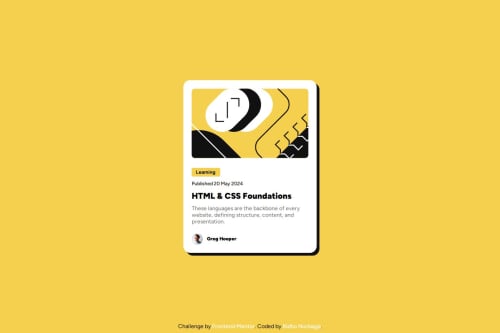
Blog Preview Card Challenge

Solution retrospective
First time I am using a figma design from here. I learn to slicing manually. Of course because I am don't understand the figma yet so I just look at the margin or padding value and boom, I add the value to my css.
What challenges did you encounter, and how did you overcome them?Encountering a problem here, in the design preview there is a desktop active that should change the color of the title from the manually black to yellow, and it seems the cursor change too. but i look the doc at mdn mozilla about pseudo selector active, and then i can change the color of the title.
What specific areas of your project would you like help with?I wish I am able to understand Grid. Because I look into the figma design there are 12 grid column and how do I make them.
Please log in to post a comment
Log in with GitHubCommunity feedback
No feedback yet. Be the first to give feedback on ridhonurbagjag's solution.
Join our Discord community
Join thousands of Frontend Mentor community members taking the challenges, sharing resources, helping each other, and chatting about all things front-end!
Join our Discord