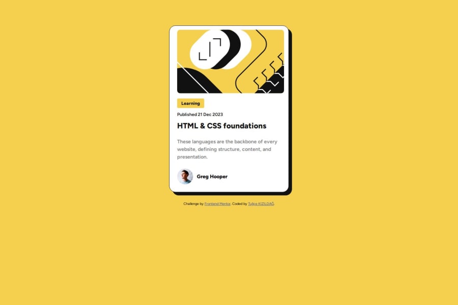
Design comparison
SolutionDesign
Solution retrospective
What are you most proud of, and what would you do differently next time?
I used Figma in this project it takes beyond the situation. I mean, i know the font-sizes,space between elements, font-weights etc. Figma is really useful for me in this project.
What challenges did you encounter, and how did you overcome them?i have some github issues when i take live my project it does not show really what i am doing on the project. i put screenshots both desktop and mobile design but only desktop design shown on the live page.
Community feedback
Please log in to post a comment
Log in with GitHubJoin our Discord community
Join thousands of Frontend Mentor community members taking the challenges, sharing resources, helping each other, and chatting about all things front-end!
Join our Discord
