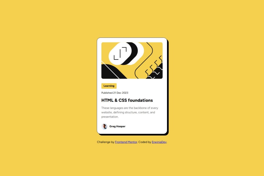
Blog preview card challenge - with HTML, CSS, flexbox
Design comparison
Solution retrospective
I think I've figured out how to use the Google fonts downloaded directly into the project.
What challenges did you encounter, and how did you overcome them?I wanted to avoid putting a max-width on the "learning" tag, so I ended up finding “align-items: flex-start”. It seemed coherent here.
What specific areas of your project would you like help with?-
I find that there are some repetitive elements in the CSS, and I didn't know how to factor it (or even if you should or shouldn't for this kind of case).
-
Is the "align-items: flex-start" ok here? (file "style.css", line 148 on the first version)
-
Is it ok for the structure of the index.html? for example the use of the "article" tag, or the tag, or the tag with class for the publication date?
Thank you very much!
Community feedback
- @ChrisRolandPosted 6 months ago
Good use of semantic HTML. I notice there's no description of your image in the
alt="", I also see that you haven't customized theREADME.mdfile.About your question no.2, I think a simple way to solve that would be
text-align: left.1@ErwiniaDevPosted 6 months ago@ChrisRoland Thank you for taking the time to give me this feedback!
1
Please log in to post a comment
Log in with GitHubJoin our Discord community
Join thousands of Frontend Mentor community members taking the challenges, sharing resources, helping each other, and chatting about all things front-end!
Join our Discord
