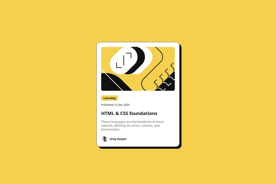
Design comparison
SolutionDesign
Solution retrospective
What are you most proud of, and what would you do differently next time?
I am most proud of the following:
- Responsive design: the card adapts well to the two given screen sizes (mobile: 375px & desktop: 1440px), which is a huge accomplishment for me. Ensuring a consistent user experience across devices is key.
- Pixel-perfect implementation: Although the Figma design didn't mention all the dimensions, I did my best to match the design as closely as possible, especially when considering details like spacing, colors, and typography.
- Code structure: I kept my HTML and CSS as organized as possible making use of the BEM methodology and semantics.
- Hover effect: Subtle interactions like the hover state over the title adds an elevation for user experience.
- CSS variables: Implementing variables for colors, fonts, and sizes would make future changes or theme switching easier.
- Flexbox: While the card may look great, digging into more advanced CSS layout techniques like Flex provides more control over responsiveness and creative possibilities.
Achieving the responsive design was the challenge. Having to ensure that the blog card looks good across different screen sizes can be tricky, especially when dealing with image scaling and maintaining layout consistency. I overcame this by the use of media queries. Media queries help to adjust the layout and make the design responsive.
Also, matching the design to the pixel-perfect was another challenge, especially with spacing and font weights. To combat this challenge, I did the best I could with what the Figma design provided.
Community feedback
Please log in to post a comment
Log in with GitHubJoin our Discord community
Join thousands of Frontend Mentor community members taking the challenges, sharing resources, helping each other, and chatting about all things front-end!
Join our Discord
