Design comparison
Solution retrospective
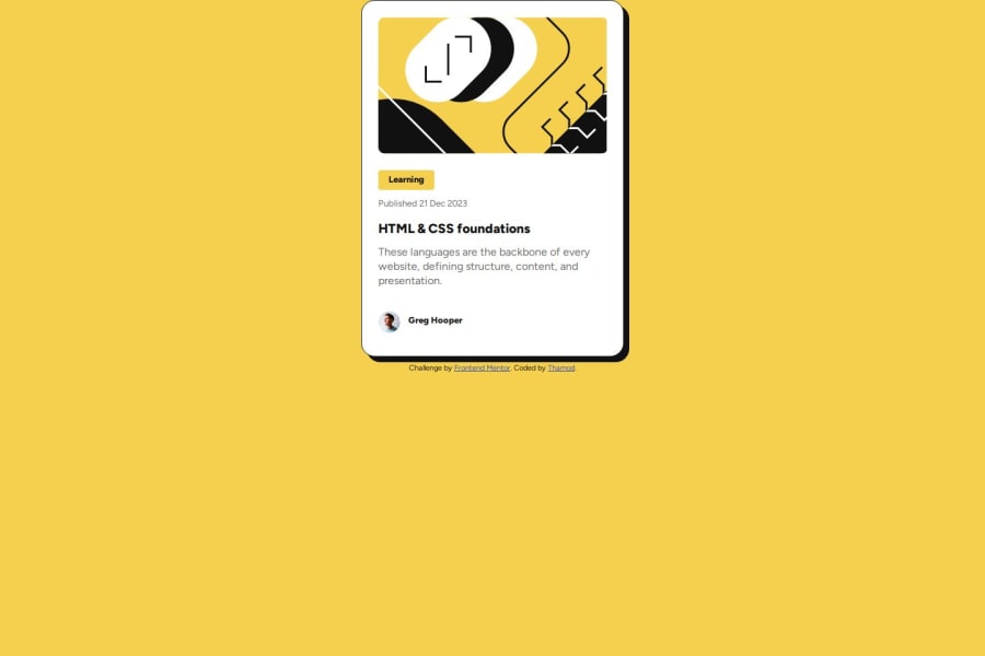
I’m most proud of how I used Flexbox to create a clean and responsive layout for the blog preview card, ensuring it looks great on different screen sizes. Next time, I’d focus more on adding subtle animations or hover effects to make the design more interactive and visually engaging.
What challenges did you encounter, and how did you overcome them?One challenge I faced was aligning elements properly within the card, especially when ensuring responsiveness across different screen sizes. I overcame this by experimenting with Flexbox properties like justify-content and align-items for adjustments. Testing frequently on mobile device also helped me fine-tune the design.
What specific areas of your project would you like help with?I would like help with improving the overall visual appeal of the blog preview card, especially in terms of adding creative hover effects and transitions. Feedback on making the design more engaging and professional while maintaining responsiveness would also be appreciated.
Community feedback
- @volti42Posted 3 months ago
To center the blog card, use the following code for the body: body{ background-color: hsl(47, 88%, 63%); display: grid; align-items: center; place-items: center; min-height: 100vh; text-align: center; justify-content: center; font-family: "Outfit", serif; }
Marked as helpful0
Please log in to post a comment
Log in with GitHubJoin our Discord community
Join thousands of Frontend Mentor community members taking the challenges, sharing resources, helping each other, and chatting about all things front-end!
Join our Discord
