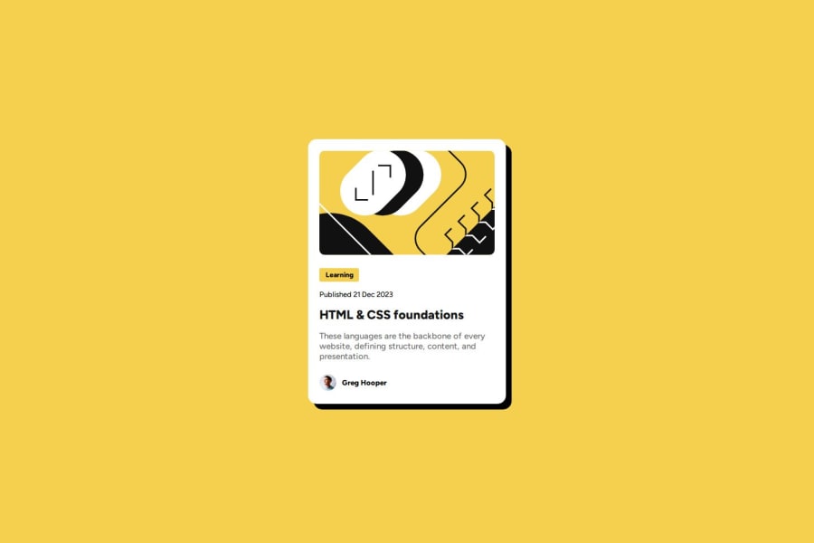
Design comparison
Solution retrospective
The blog preview challenge has taught me how to adapt my approach to coding. Taking time to see, and notice the structure & flow, first. To spend my time in the inspect box more than development area, as it's where i get to quickly test. With this, I appreciated the work of community mentors, and how we write unorganized code that can be unreadable. So i added comments and whitespace to improve readability and used a simple HTML structure! I also used feedback from previous projects,and used media queries to improve my project.
What challenges did you encounter, and how did you overcome them?any feedback is welcome
What specific areas of your project would you like help with?In coming projects, i seek to improve on fonts. and responsive design
Community feedback
- @Randomgituser69Posted 4 months ago
This component is missing a border plus also when you're coding a component. You don't actually have to use media query since the size will get adjusted. Plus I'm not sure if it's ok to use the main tag for the content inside the component but it's best not to use it like that. Instead use main like this which is shown below:
 <main>
<section class="">
 <header>
    <img src="" alt="">
    <p class=""></p>
    <p class=""></p>
  </header>
 <div class="">
      <h2></h2>
      <p></p>
 </div>
</section>
 </main>
As for what you've using main for before, better to use a div with a class. Also for the component, it's better to use section as a container for the component.
Marked as helpful0
Please log in to post a comment
Log in with GitHubJoin our Discord community
Join thousands of Frontend Mentor community members taking the challenges, sharing resources, helping each other, and chatting about all things front-end!
Join our Discord
