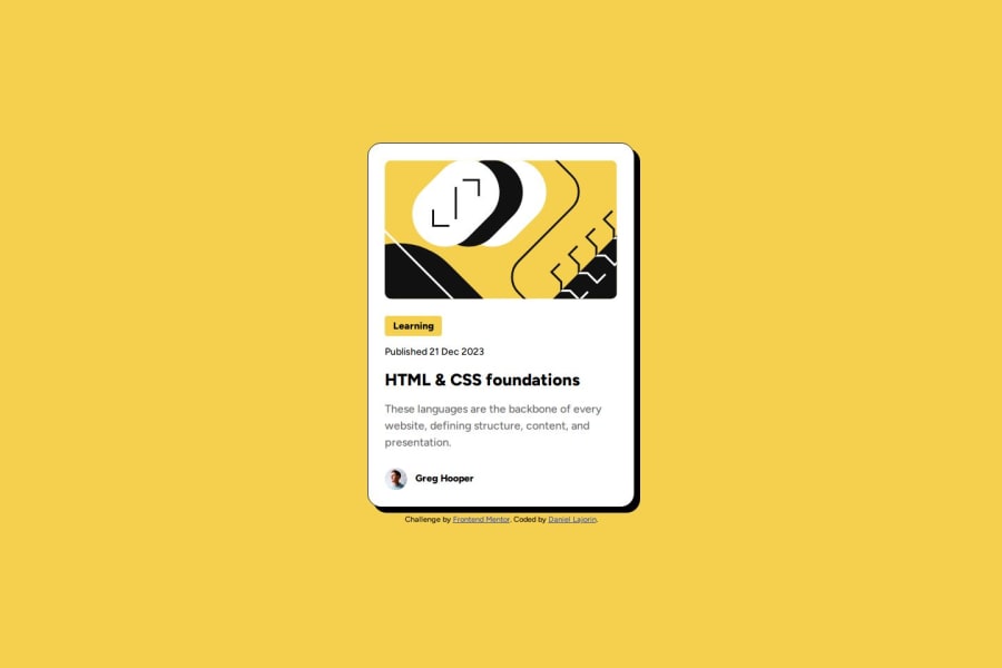
Design comparison
Solution retrospective
I'm most proud of using the clamp() function for the first time. Next time, I will start of implementing the clamp() function when setting font size and element dimensions if required.
What challenges did you encounter, and how did you overcome them?My main struggle was figuring out how to closely match the sizing of the elements to the dimensions provided in the design files without relying fixed measurements and media queries.
For a while I thought the issue was sprouting from the size I set the entire card to but in the end I realised that it was a font-sizing problem. Once I realised this, I began looking in the direction of fluid typography and stumbled across the clamp() function.
What specific areas of your project would you like help with?Anywhere I could improve with my Semantic HTML. Better methods to achieve responsiveness in my CSS rulesets.
Community feedback
- @Davzp1980Posted 7 months ago
Includes semantic HTML No improvements needed. Does layout look good on different sized screens. Is the code well structured, readable and reusable. Executed according to the design
0
Please log in to post a comment
Log in with GitHubJoin our Discord community
Join thousands of Frontend Mentor community members taking the challenges, sharing resources, helping each other, and chatting about all things front-end!
Join our Discord
