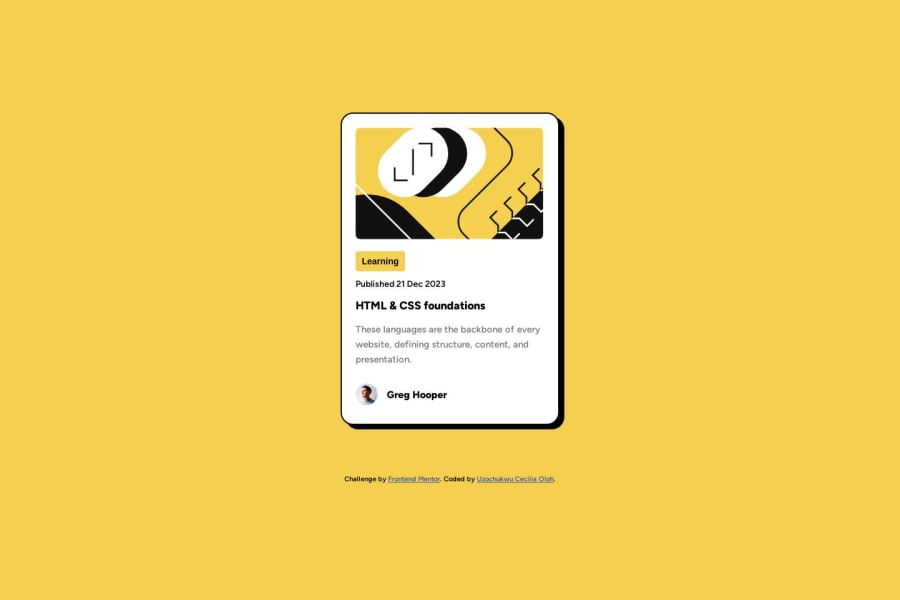
Blog preview card built using simple HTML and CSS
Design comparison
Solution retrospective
Hello Everyone, The challenges I faced building this preview card was the media query and width of the container.
All feedbacks are welcome. Thank you!
Community feedback
- @BlackpachamamePosted over 1 year ago
Greetings! you have done a great job 😎
📌 Some accessibility and semantics recommendations for your HTML
- To improve the semantics of your HTML, you can change your
<div class="container">to a<main class="container">and the<div class="attribution">to a<footer class="attribution">
📌 Some suggestions
- You can apply
display: blockto the image to remove the white space generated underneath. Although visually in this case it is irrelevant, it helps you better calculate the space with other elements - Apply
max-width: 100%to yourimgso that it occupies the correct width within the container. Removewidth: 300px - Instead of using
marginto center your content in the center of the screen, you can use theflexboxproperties in thebody:
body {
      font-family: 'Figtree', sans-serif;
      background-color: var(--background-color);
      padding: 30px 40px;
      min-height: 100vh;
      display: flex;
      justify-content: center;
      align-items: center;
      flex-direction: column;
      gap: 20px; /* Separate the main from the footer */
}
Marked as helpful2@NseboPosted over 1 year ago@Blackpachamame Thanks so much for your honest feedback. Your code made more sense when I added it to mine :) I had problem understanding the difference between max-width and width, I need to learn more on max-width and width. Thanks once again for taking your time to correct my work.
1 - To improve the semantics of your HTML, you can change your
- @MelvinAguilarPosted over 1 year ago
Hello there 👋. Good job on completing the challenge !
I have other suggestions about your code that might interest you.
- The
cursor: pointerproperty should only be used on interactive elements that perform an action. If you apply it to a<main>tag, you might confuse the user, making them think that clicking will trigger something.
- To make the alt attribute as useful and effective as possible, avoid using words such as "image", "photo", or "picture" as they are redundant because the image tag already conveys that information.
- For a photo of a person, use their name as the alt text
- Instead of using pixels in font-size, use relative units like
emorrem. The font-size in absolute units like pixels does not scale with the user's browser settings. Resource 📘.
I hope you find it useful! 😄
Happy coding!
Marked as helpful1@NseboPosted over 1 year ago@MelvinAguilar Thanks for your honest feedback and your suggestions, your suggestion made me noticed that I was done with coding. I will have to add the pseudo class property :active and color changes when clicked on the title.
Thanks for the resource added, will read more the on the em and rem. Thank you!
0 - The
- P@danielmrz-devPosted over 1 year ago
Hello @Nsebo!
Your project looks great!
I noticed that you used
marginto place the card in the middle of the page. Here's a very efficient way to center the card:- Apply this to the body (in order to work properly, don't use position or margins):
body {
    min-height: 100vh;
    display: flex;
    justify-content: center;
    align-items: center;
}
I hope it helps!
Other than that, great job!
Marked as helpful1@NseboPosted over 1 year agoThank you for taking your time to look through my work, I appreciate your honest feedback and i will do the needful to my code. Thank you! @danielmrz-dev
1 - @SamadeenPosted over 1 year ago
Hello Nsebo
Great work on completing this challenge. Cheers!! 🎊🎊
Some adjustments are needed to place your container in the middle properly.
    display: grid;
     place-content: center;
     min-height: 100vh;
I hope to see more solutions from you.
1@NseboPosted over 1 year agoThanks for your honest feedback, I will make the correct right away. Thank you!@Samadeen
0
Please log in to post a comment
Log in with GitHubJoin our Discord community
Join thousands of Frontend Mentor community members taking the challenges, sharing resources, helping each other, and chatting about all things front-end!
Join our Discord
