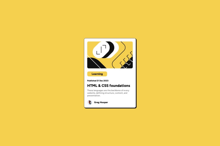
Blog Preview Card - Basic HTML/CSS with Responsive Design


Design comparison

Solution retrospective
Hey everyone :)
Would appreciate feedback! What would you do differently or what can I do better next time?
Thanks in advance! Axel
Community feedback
- @turanarican2022Posted 10 months ago
First congrats for making it to the end.
Here my thoughts
-- I would use for the "Learning" card a span instead of h3. -- I would use <address> for the author info (as MDN recomends) -- You should give some line-height to the <p> element as per the original design requires it -- You did give the "Learning" tag too much padding than the design -- Lastly, your card text is too bold
Marked as helpful1 - @danielmrz-devPosted 10 months ago
Hello @meisteraxel!
Your project looks great!
I noticed that you used
positionto place the card in the middle of the page. Here's a better way to center the card:- You can apply this to the body (in order to work properly, you can't use position or margins):
body {
    min-height: 100vh;
    display: flex;
    justify-content: center;
    align-items: center;
}
I hope it helps!
Other than that, you did an excellent job!
Marked as helpful0 - @MelvinAguilarPosted 10 months ago
Hello there 👋. Good job on completing the challenge !
I have other suggestions about your code that might interest you.
- When you use the hover effect and cursor: pointer on an element, it usually implies interactivity. To enhance user experience, consider wrapping the name of the "HTML & CSS foundations" text in an
<a href="#">tag. This way, users can click on it, expecting some action, like navigating to a page with more information about the fundamentals.
- For a photo of a person, use their name as the alt text
- Instead of using pixels in font-size, use relative units like
emorrem. The font-size in absolute units like pixels does not scale with the user's browser settings. Resource 📘.
I hope you find it useful! 😄 Above all, the solution you submitted is great!
Happy coding!
Marked as helpful0 - When you use the hover effect and cursor: pointer on an element, it usually implies interactivity. To enhance user experience, consider wrapping the name of the "HTML & CSS foundations" text in an


Please log in to post a comment
Log in with GitHubJoin our Discord community
Join thousands of Frontend Mentor community members taking the challenges, sharing resources, helping each other, and chatting about all things front-end!
Join our Discord