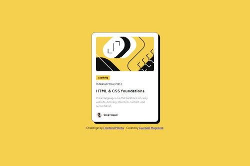
Blog preview card. Accessible card, SCSS, Vite
Design comparison
Solution retrospective
I'm happy to learn about accessibility. It can change a lot of things on how we structure the html and the css. For the card, I wanted to make the whole card focusable and clickable by keeping a clean html structure.
What challenges did you encounter, and how did you overcome them?Getting the spacing perfectly right isn't easy. I spent a lot of time tweaking values around. I need to find a way to structure this better.
What specific areas of your project would you like help with?I want to learn more about scss mixins and functions. And also learn how to do more modulare css.
Community feedback
- @verakissyou17Posted 6 months ago
Congratulations for your project and the perfect design that you've created!Your project looks awesome! For the next challenges you could use partials in sass to organize your code better! Good luck on your journey!
1@gmagnenatPosted 6 months ago@verakissyou17 Thank you for checking out my solution ! I started to use partials for resets, mixins and variables in my latest challenges.
1 - @geomydasPosted about 2 months ago
I'm no expert but why did you choose to have a flex wrapper paired with gaps inside the .card__content-wrapper? The design has uneven gaps throughout, why not use margins? Why is the heading not an h1 but instead of an h3? I was taught to not skip heading levels. Also, shouldn't the span with the text of "Learning" be a link? Another thing is why did you choose to use calc() inside of the clamp() in a card div?
0@gmagnenatPosted about 2 months agoHi @geomydas how's it going?
- why a flex wrapper with gaps.
This made sense to me when doing this challenge and helped as you said to have consistent spaces between "learning", "date", "title" and "description". There are many ways to achieve the same thing.
- Why not an H1?
This is a card component, not a full page website. I would expect a page to have one main heading (h1), one section heading (h2) and then the different card headings (h3). That's how I thought about it.
- Shouldn't the span with the text of "Learning" be a link?
Why so? This element isn't indicated with an hover or active state in the design. The link to the blog post is the title of the card. If you want to make the category tag clickable and be a link to an archive of this category this is your implementation and you are free to do so. It can also simply be an information. It's not because it "looks" like a button that it needs to be interactive.
- Why I use calc() inside the clamp() ?
Mentioned in my README, I use this tool to calculate a smooth clamp value between two viewports. There's a bunch of explanation on this page and why it works smoothly by keeping the fonts accessibles.
I hope this helps?
0
Please log in to post a comment
Log in with GitHubJoin our Discord community
Join thousands of Frontend Mentor community members taking the challenges, sharing resources, helping each other, and chatting about all things front-end!
Join our Discord