Design comparison
SolutionDesign
Solution retrospective
What are you most proud of, and what would you do differently next time?
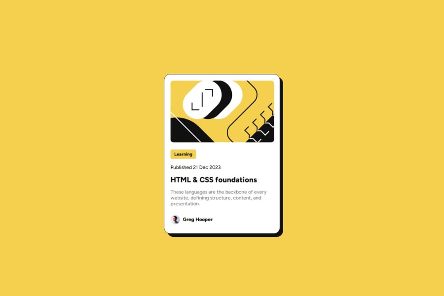
I am really happy with how the card turned out for the mobile design
What challenges did you encounter, and how did you overcome them?Main challenge was getting the sizing and layout right. A lot of trial and error was required.
What specific areas of your project would you like help with?Feedback on how to improve the layout / design if any
Community feedback
- @kyloren808Posted 8 months ago
Your solution is using semantic HTML. Viewing the site with Developer Tools, the page is responsive on desktop and mobile devices. The layout is very close to the design layout and follows the style guide as required. I would suggest using more semantic HTML tags in place of the DIVs.
0
Please log in to post a comment
Log in with GitHubJoin our Discord community
Join thousands of Frontend Mentor community members taking the challenges, sharing resources, helping each other, and chatting about all things front-end!
Join our Discord
